
Apple Music’s new identity: designed by sound, with a very human mastery

On October 21, 2026, Apple Music introduced Made by Sound, a complete brand update made with TBWA\Media Arts Lab, Fred again.. and NEST Acoustics. In this post you will see how the experiment worked, what changed in the logo, who is behind the work (with a highlight on the Brazilian studio Plau), how the Apple Music Hall fits into this story and what all of it teaches anyone who builds brands.
The logo
that music
drew
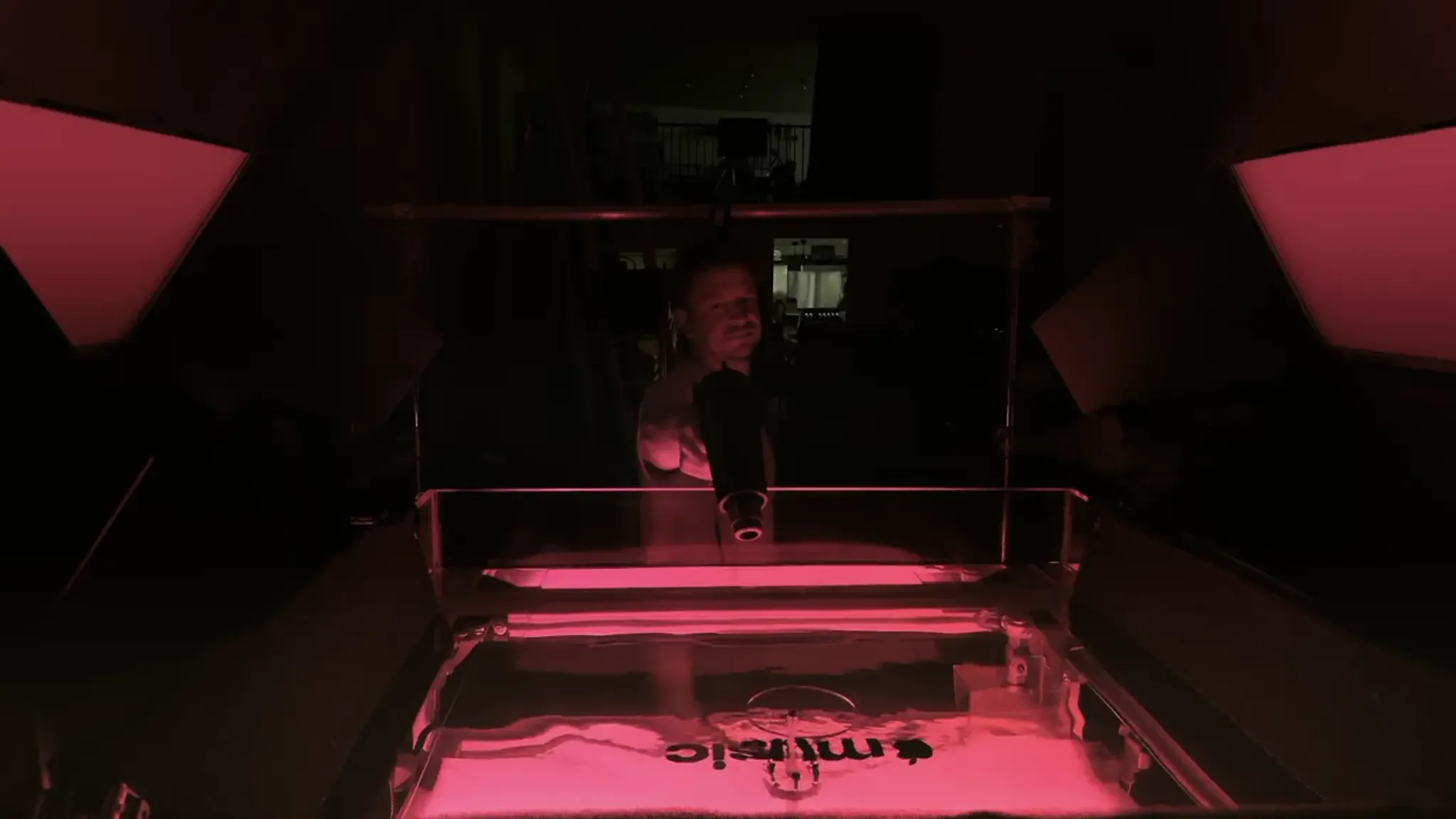
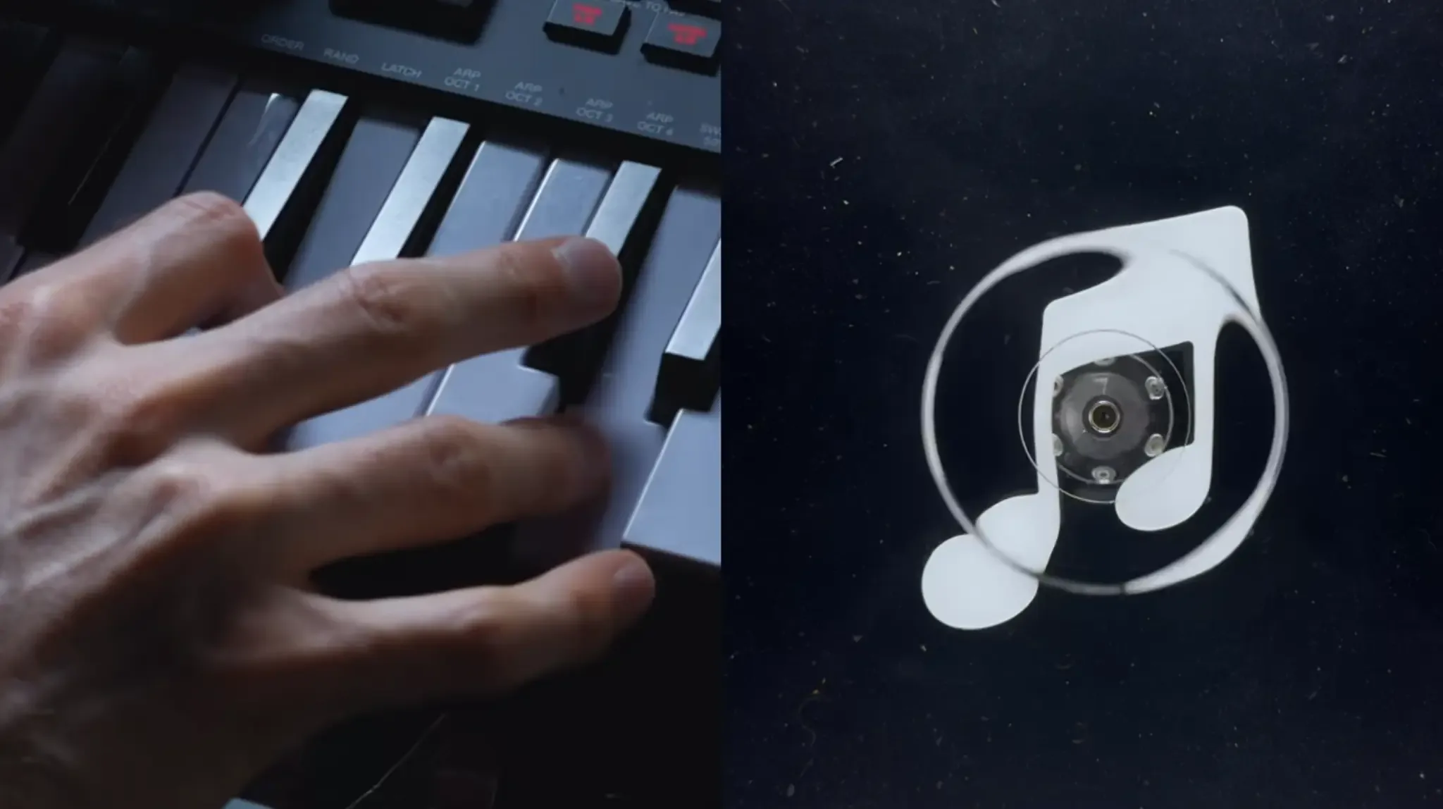
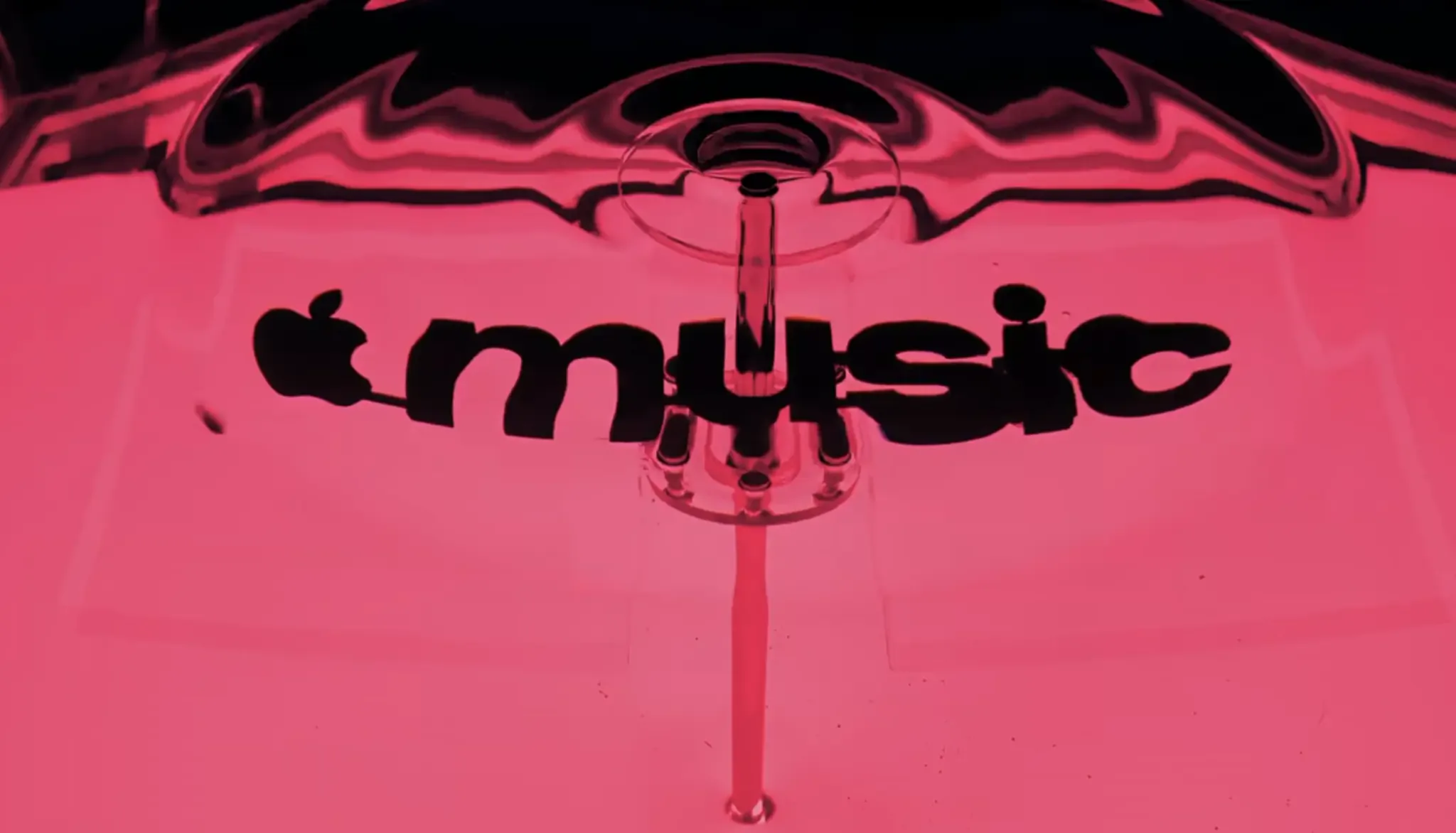
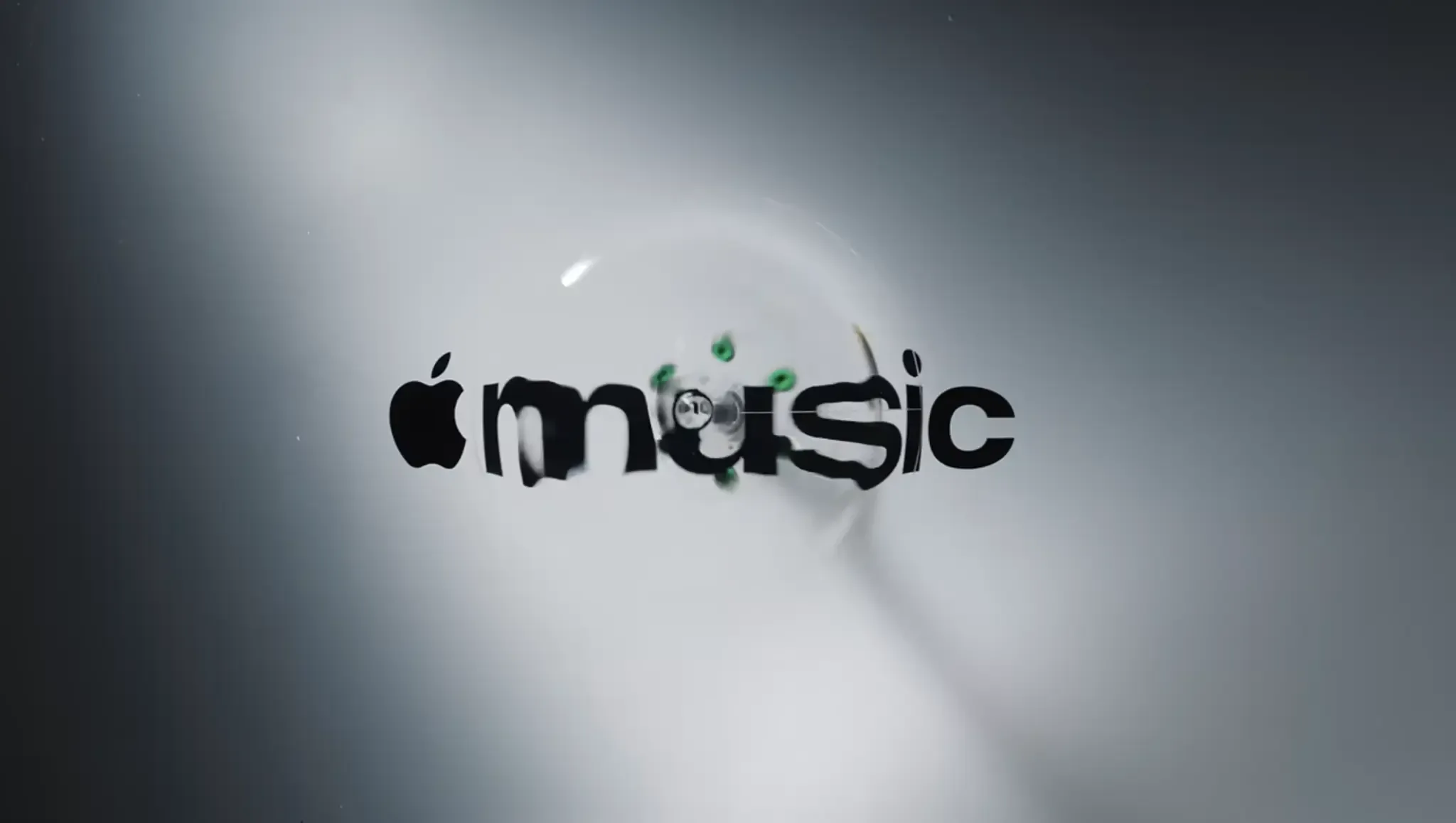
The team created an original composition and split the piece into notes and frequencies. A transducer sent those tones to a shallow bath of mineral oil, where acrylic pieces of the music icon and the logotype were submerged. The vibrations formed waves and refractions around them, and everything was filmed in camera.
- Original composition by Fred again..
- Music split into notes and frequencies
- Transducer sends sound into mineral oil
- Acrylic logo submerged in the bath
- Waves and refractions filmed in camera
- Footage becomes identity, motion and film
Inside the
lab
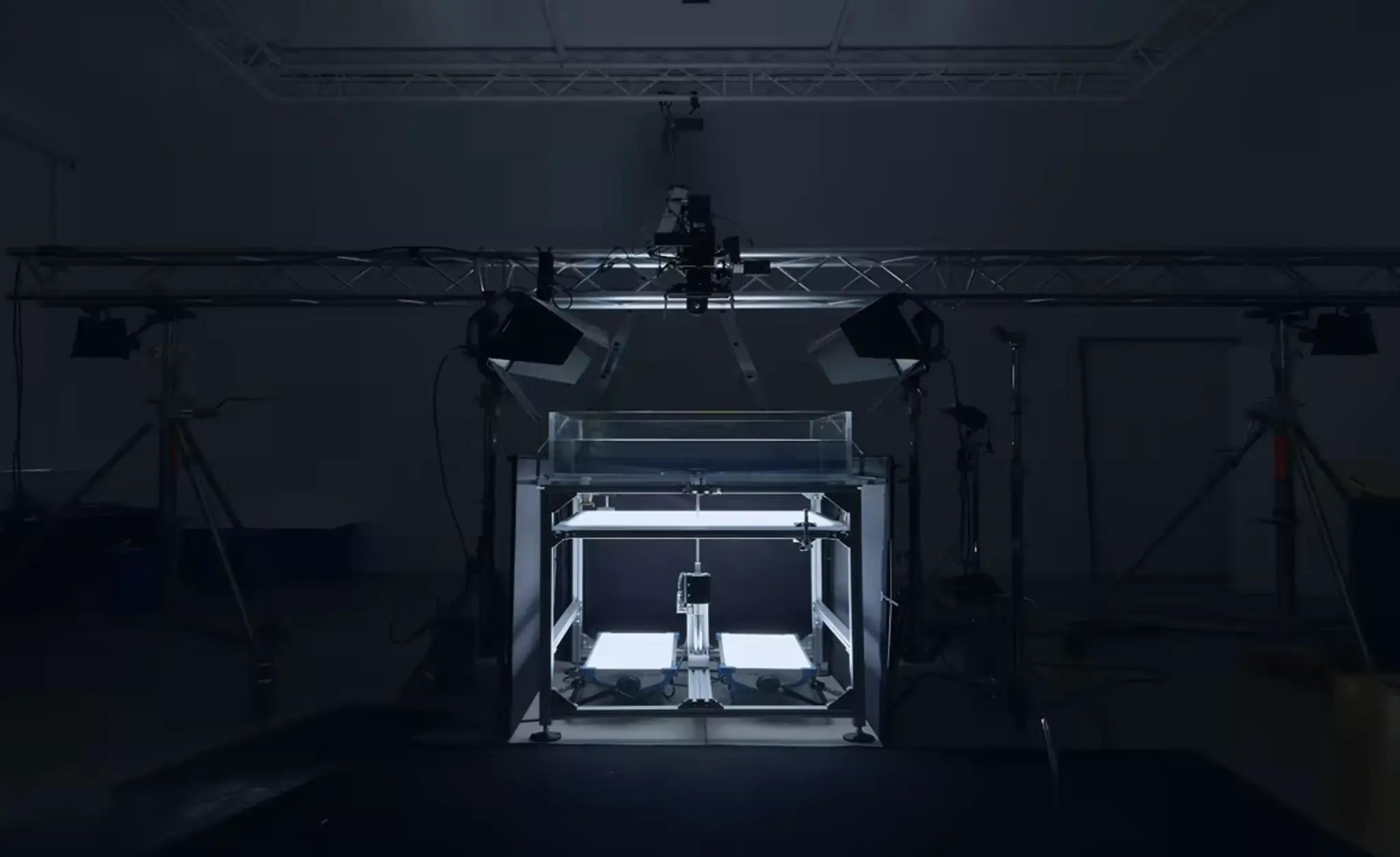
The team built its own equipment and software to control the experiment. The oil’s viscosity was chosen because it produces ripples with a glassy look.
Each frequency generates a different pattern, and that allowed the whole composition to be translated into a coherent visual vocabulary. Swipe the images beside this text to see the rig, the tray and the logo taking shape.

Four pieces
in one
system

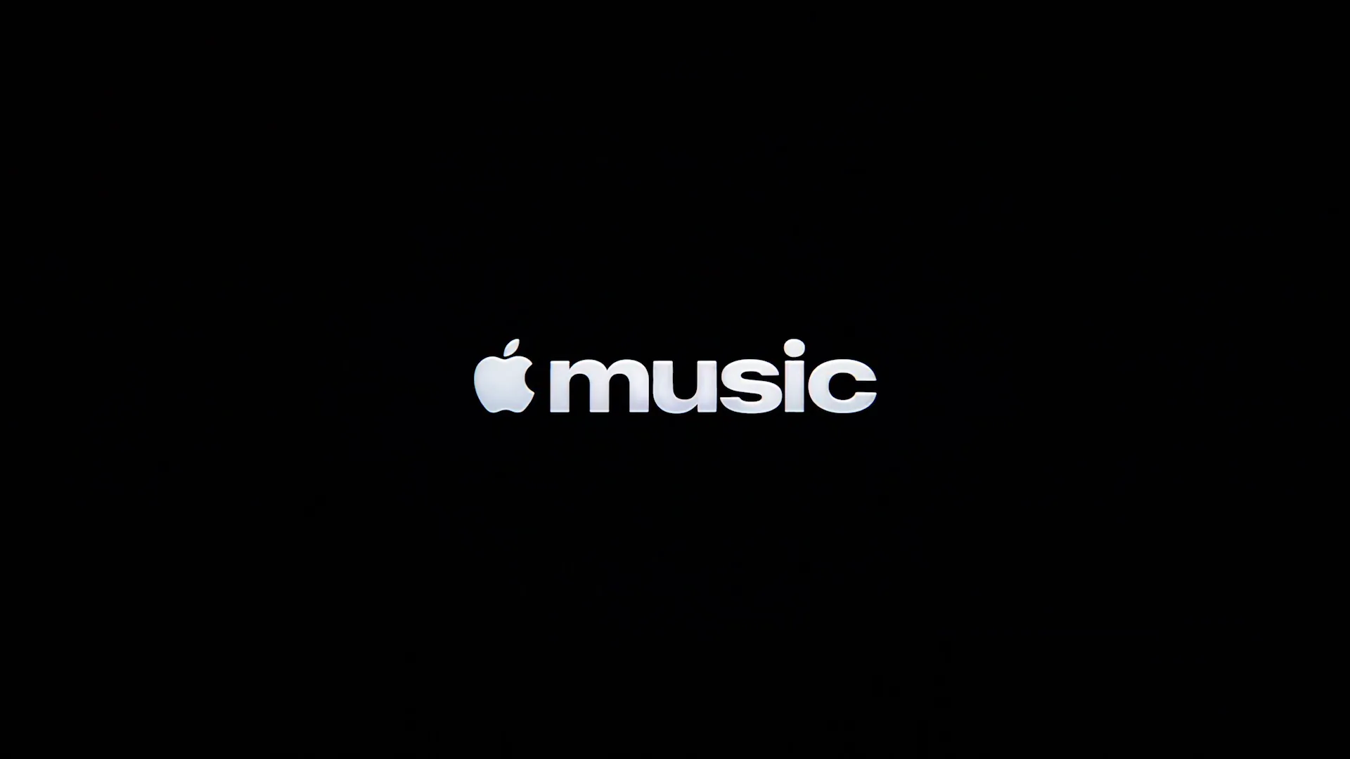
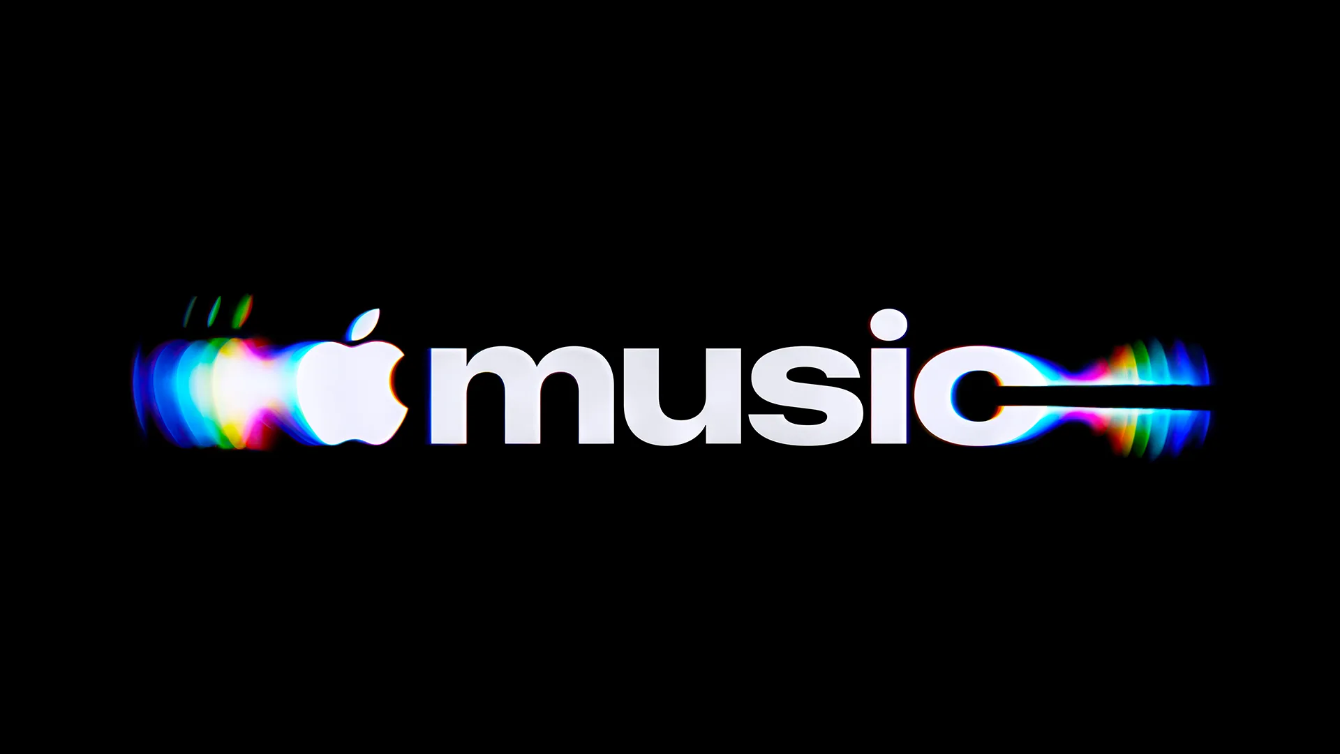
Wordmark. The Apple symbol followed by “music” in lowercase, with a heavier, more compact design. Project sources describe the word as a customized version of the SF Pro family.
Icon. The musical note was redrawn and became more expressive. In the static version released for the app, it appears in black and white in place of the familiar red and pink icon.
Motion. Waves, echoes and colorful refractions come from the physical experiment. That gives the motion a clear rule: the brand reacts to real sound.
Sound. Fred again.. and NEST Acoustics created a short composition that works as a sonic signature and also drove the physical installation. The same source connects audio and image.
The system in the campaign
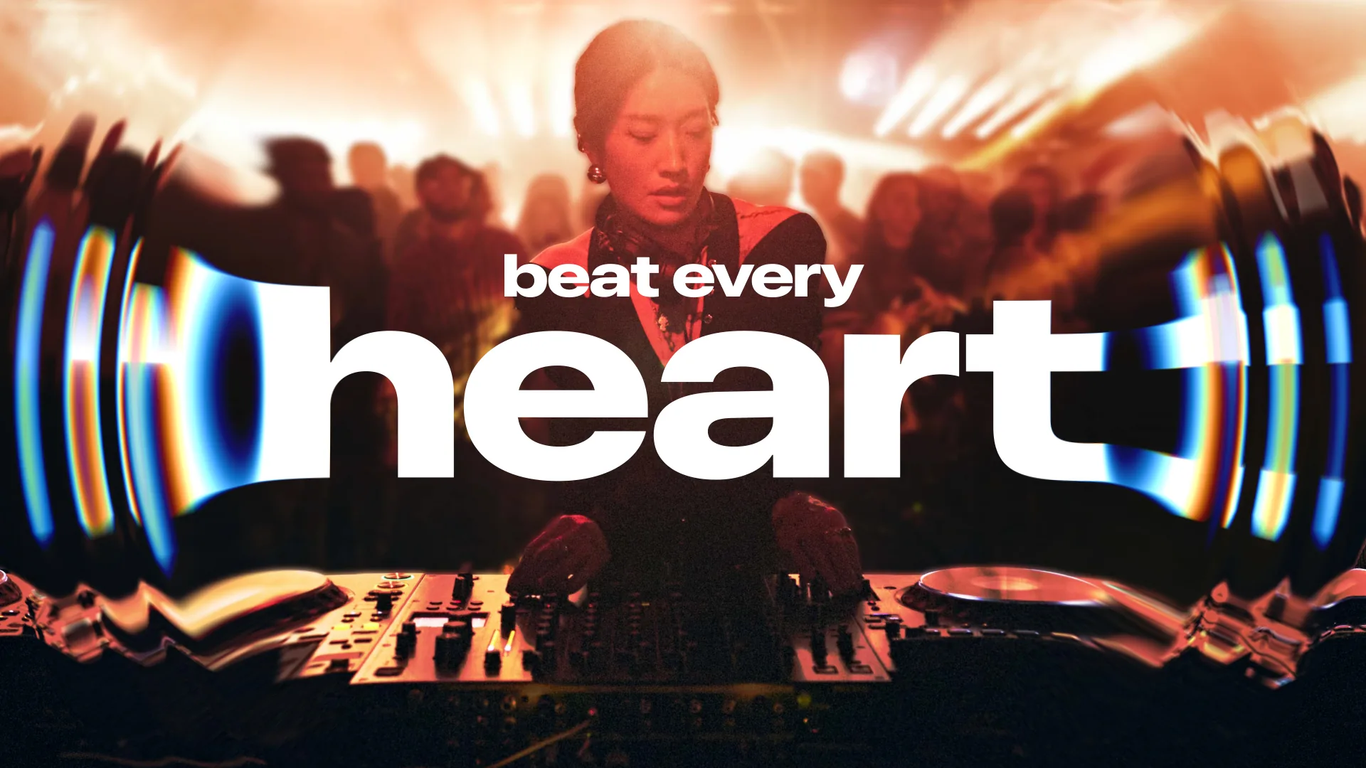
The campaign is where the system shows what it can do. The wordmark stretches like a wave over concert photos, billboards get colorful DJ decks and the launch film brings it all together with Fred again..’s soundtrack.

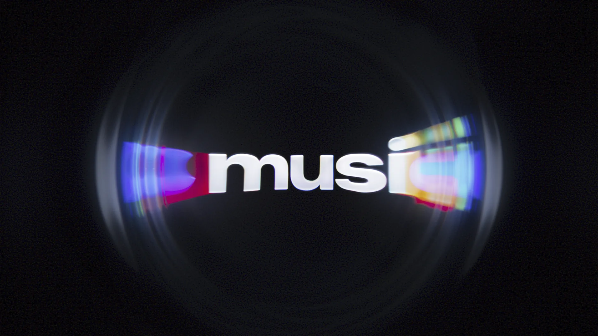

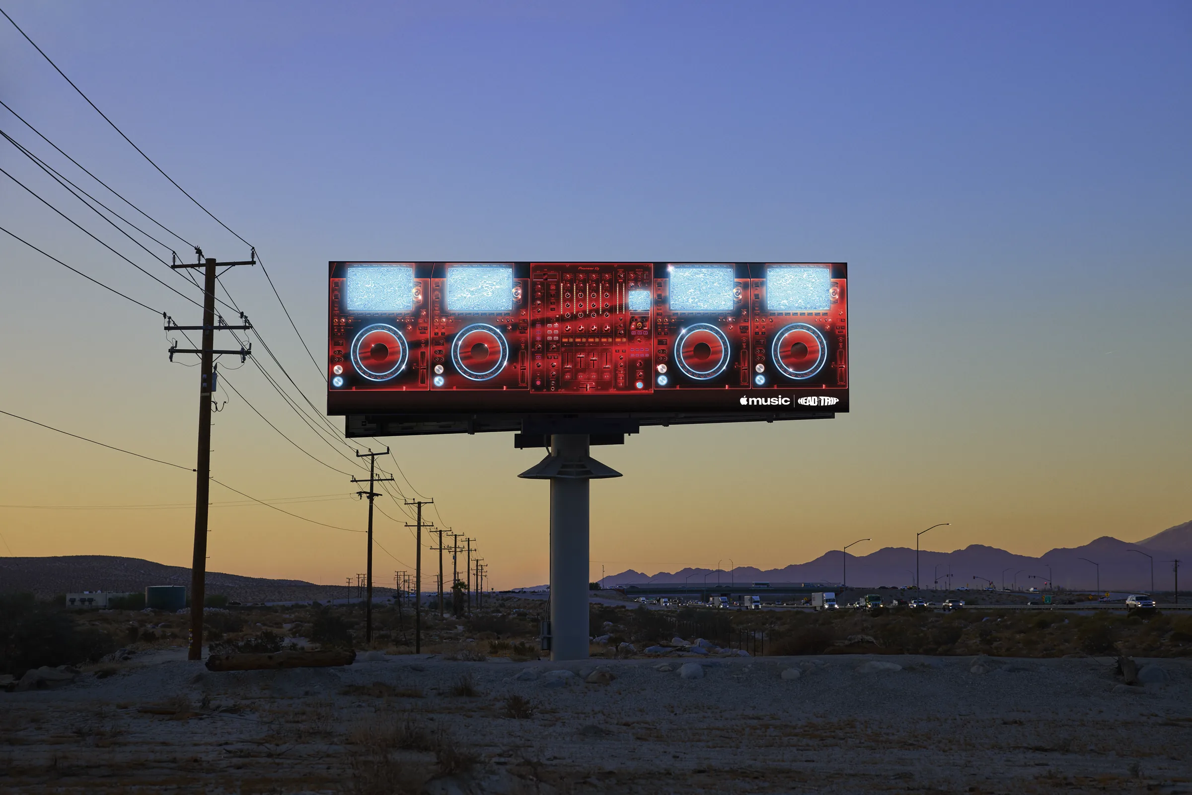
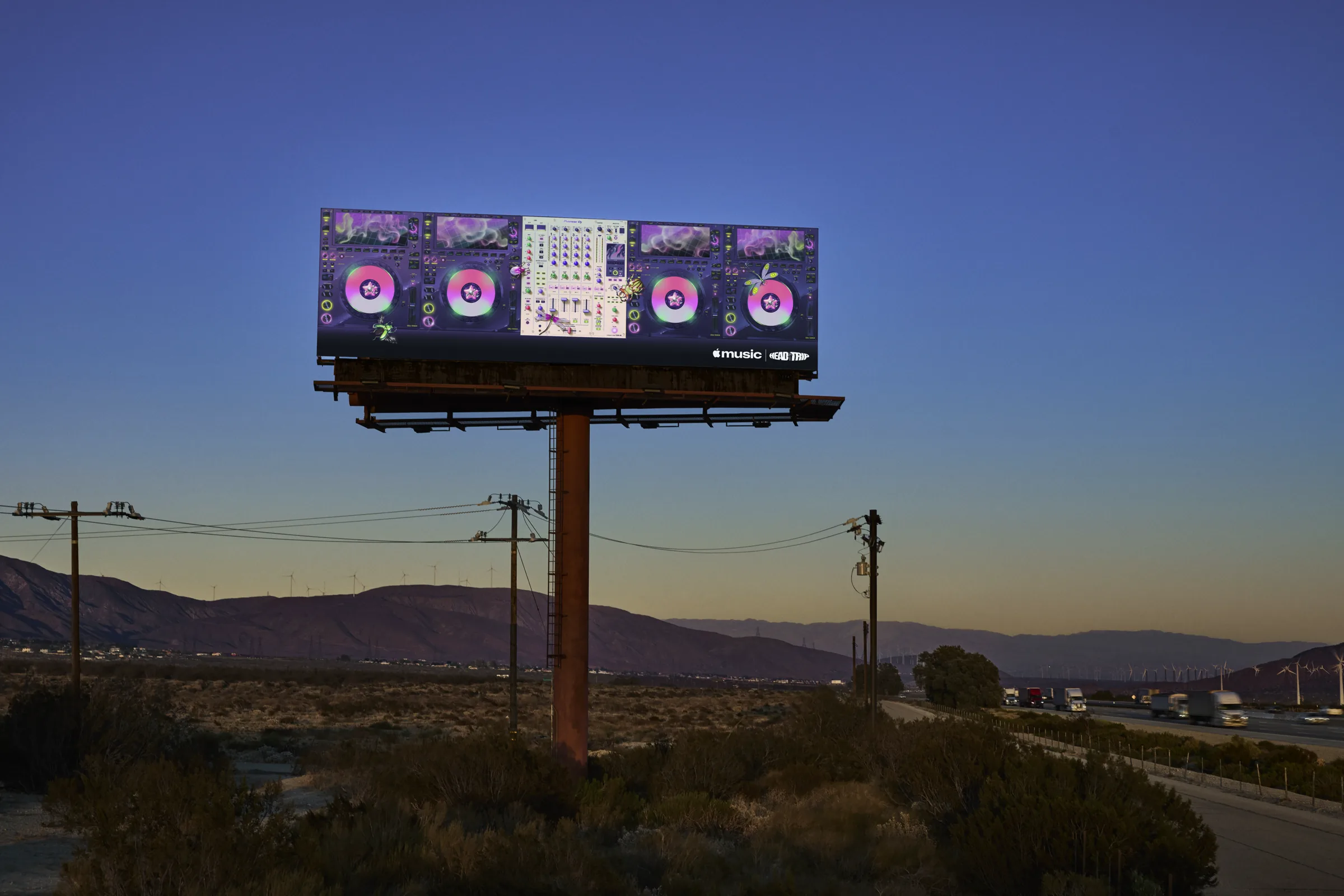
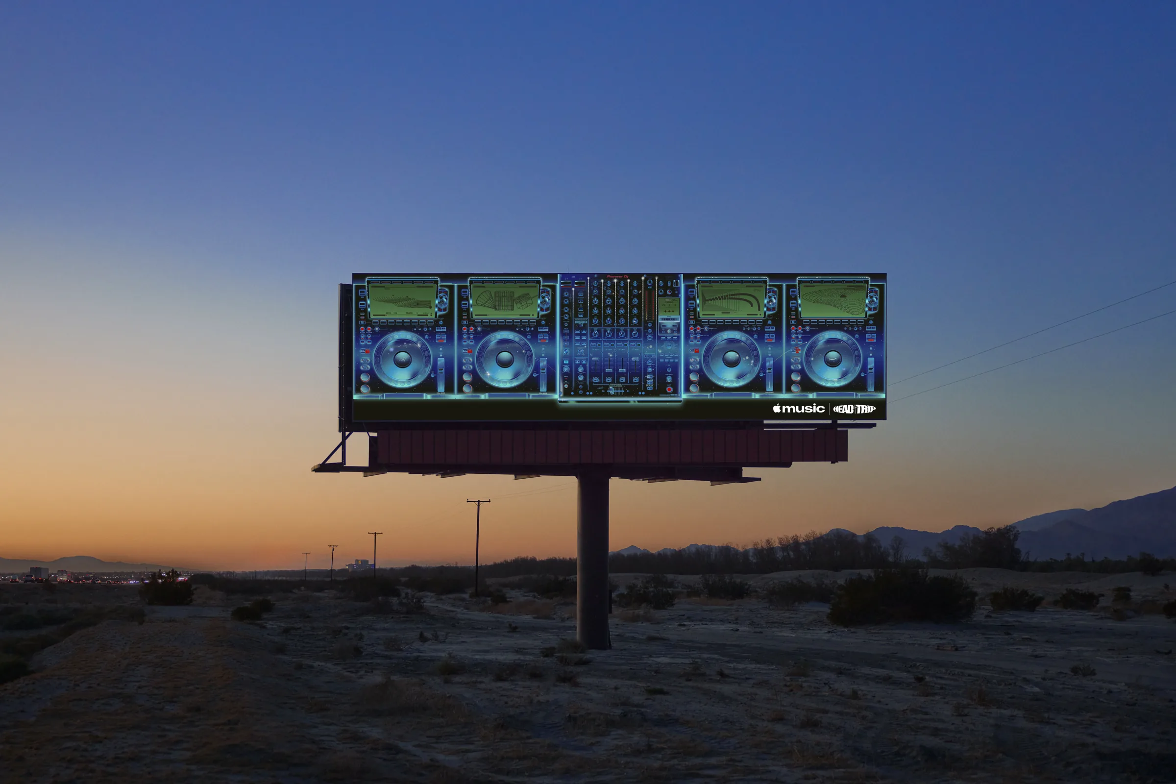
The official website already uses the system.
The wordmark, surrounded by rings of refracted light, takes full advantage of the motion the new brand was born with.
The details
that deserve
precision
Part of the press summed up the process as “water”. The production descriptions closest to the project mention mineral oil, chosen for its viscosity, which creates ripples with a glassy look.
The base phenomenon was produced physically and captured in camera. The credits also list VFX, color grading, finishing and still-image post-production.
Captured in camera
VFX and finishing
- Agency and designTBWA\Media Arts Lab LA
- ProductionOptical Arts, directed by Joe Jackson
- MusicFred again.. with NEST Acoustics
- VFXTime Based Arts
- Color and finishingTRAFIK
- MixModel Citizen
- Typography and logo vectorPlau
On the agency side, these TBWA\Media Arts Lab professionals shared the behind the scenes on LinkedIn:
- James TaylorGlobal Head of Design
- Lara JurianszCreative Director
- Sabine DowekGroup Creative Director
- Cam TribeAssociate Creative Director
- Jun Hong Parkcited by Rodrigo Saiani
- Hannah Arrigonicited by Rodrigo Saiani
To see more of each person’s work: Lara Juriansz‘s portfolio, James Taylor’s D&AD profile and Lara’s profile on D&AD.
Who is behind
the project.
Brazilian
typography.
Plau is a Brazilian typography and brand identity studio, founded by Rodrigo Saiani. On Made by Sound, the studio did the typographic consultancy and the vector reconstruction of the logotype. In a LinkedIn post, Saiani said he worked with TBWA\Media Arts Lab on the rebrand and that the work was made without artificial intelligence, by hand. It is worth attributing this to him, because it is a personal account of Plau’s contribution. You can follow the studio on LinkedIn and Instagram, and Rodrigo Saiani’s portfolio is on Behance.
Want to meet more voices of type design made in Brazil? Read our overview of Brazilian typography in 2026.

From stage
to icon.
A month before Made by Sound, on September 21, 2026, Apple opened the Apple Music Hall at Battersea Power Station in London. Apple Newsroom describes a venue designed for live sound and image.
Swipe to see the stage, the foyer and the Apple Music Radio rooms.
- 600 seats
- 48 audio speakers
- 38-foot stage
- 16+ cameras
- Battersea, London


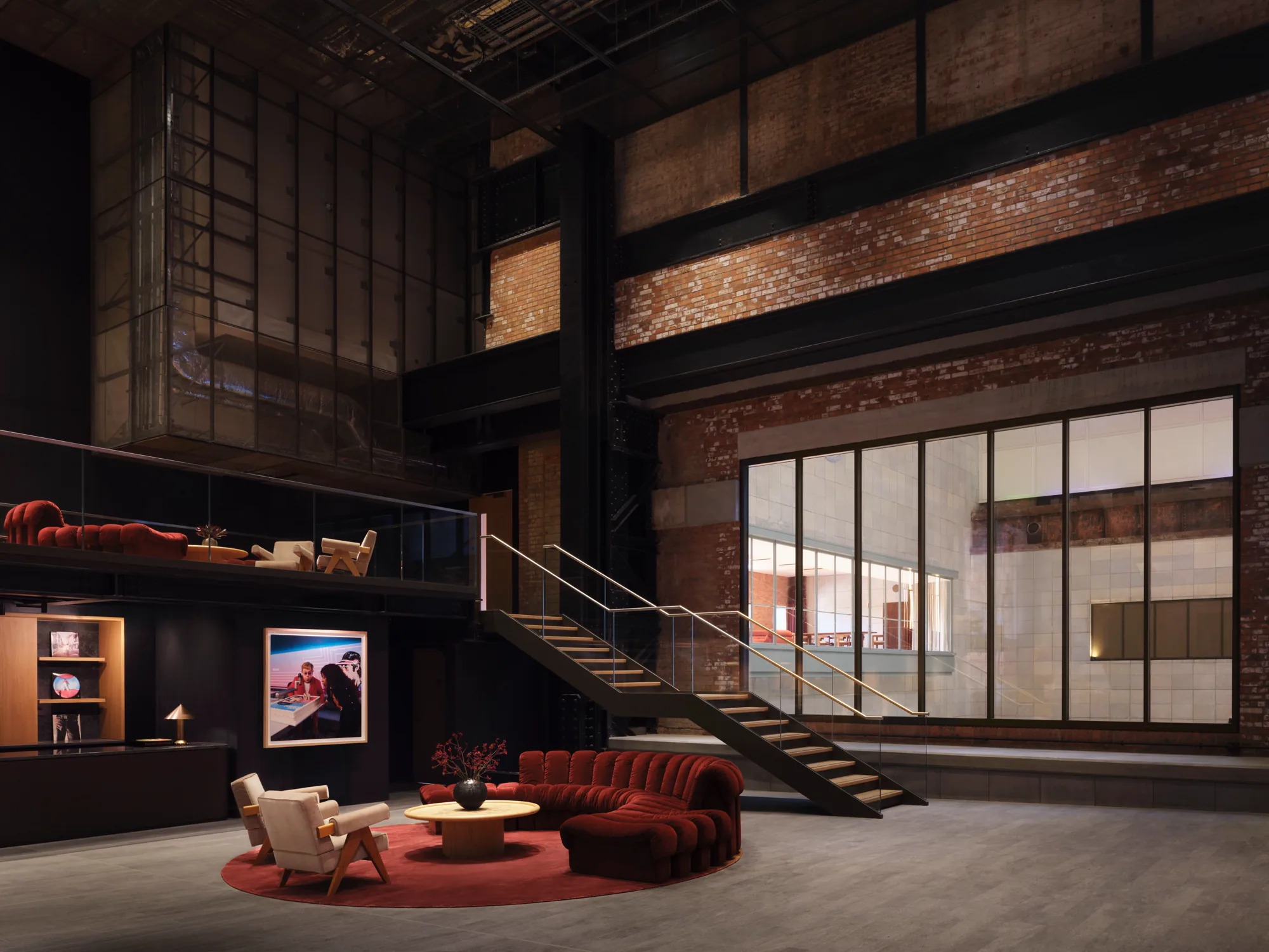
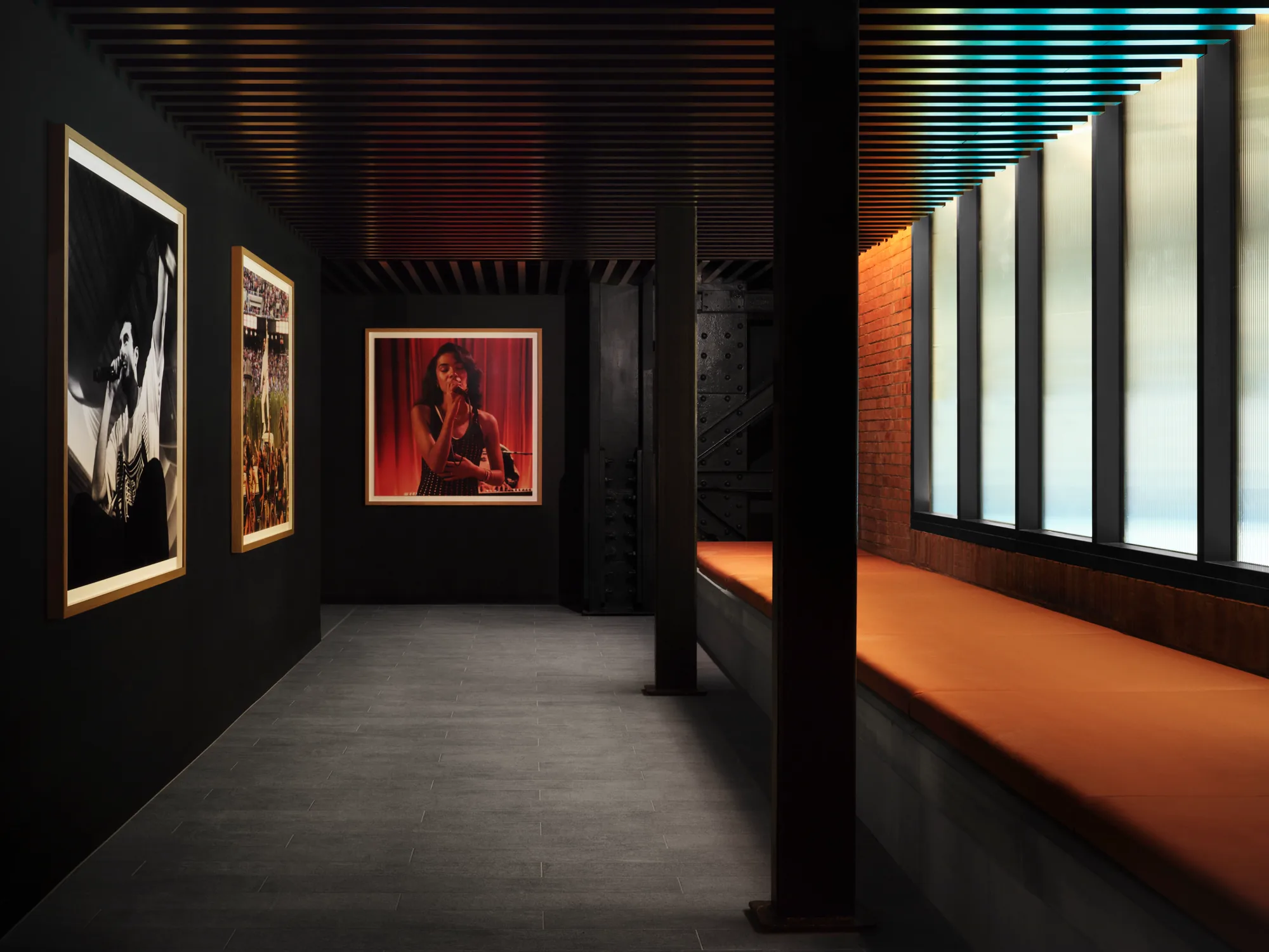

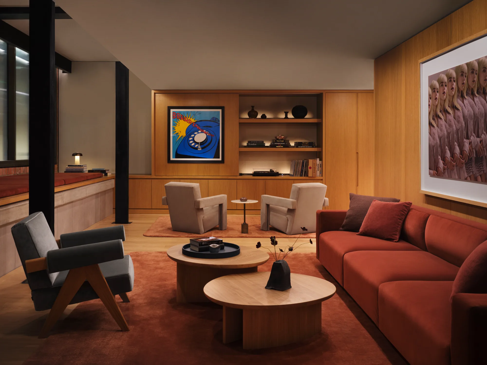
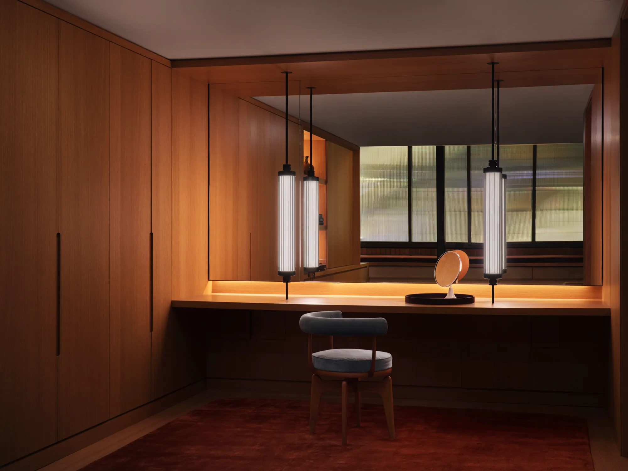
This reading is mine: the closeness of the dates suggests an Apple Music that wants to be seen as a cultural and experiential brand, beyond a streaming app. I found no official statement linking the Hall and the rebrand as a single program, so this part stays an interpretation.

The static black and white icon is extremely reduced. The moving system is colorful, liquid and exuberant. That distance can be a strength, with simple recognition in the product and rich expression in campaigns. It can also be a risk, if the audience sees only the icon and loses the physical concept that gives it meaning.
Sober in
the app, vibrant
in the campaign.
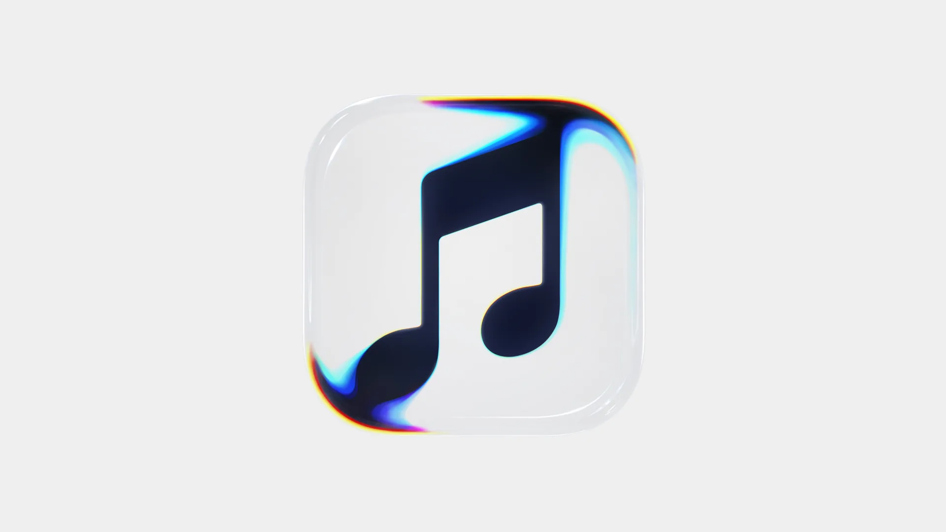

Red stepped aside.
Sadly for some users, red almost left the stage. In this research I found many comments from people furious at Apple’s decision. What few noticed is that Apple took the spotlight off itself to put it on the platform’s artists. With red taking over everything, how would each artist’s identity share the same screen without noise?
6 lessons
to take to
your brand.
You do not need a vat of oil to use the idea.
You need a rule that explains where your brand comes from.
Give motion an origin
Motion born from a rule gains coherence in any piece.
Show the process
Real behind the scenes build authorship in a world of synthetic imagery.
Test at the smallest size
The small icon is where the public sees your brand most, day to day.
Think in systems
Symbol, type, motion and sound work together as one voice.
Plan for variation
A shared logic fits different artists, genres and campaigns.
Call in specialists
Typography and vectors need people who live for them, as Plau did with the logo.
What is Apple Music’s Made by Sound?
It is Apple Music’s new brand identity, introduced on October 21, 2026. It was developed by Apple Music with TBWA\Media Arts Lab, in collaboration with Fred again.. and NEST Acoustics, and uses sound frequencies to shape the logo, the icon and the motion.
How was the new Apple Music logo made?
An original composition was split into notes and frequencies. A transducer sent those tones into a shallow bath of mineral oil, with acrylic pieces of the logo and the icon submerged in it. The resulting waves and refractions were filmed in camera and became the basis of the identity.
Did the experiment use water or oil?
Production descriptions point to mineral oil, with a viscosity chosen to create ripples with a glassy look. Some secondary articles summed up the process as water.
Was the logo made without computer graphics?
The base phenomenon was produced physically and captured in camera. The credits also list VFX, color grading, finishing and still-image post-production, which means there was digital finishing after capture.
Who created Apple Music’s new identity?
Apple Music and TBWA\Media Arts Lab in Los Angeles, with music by Fred again.. and NEST Acoustics, production by Optical Arts (directed by Joe Jackson), VFX by Time Based Arts, color and finishing by TRAFIK, mix by Model Citizen and typographic consultancy by Plau.
What changed in the logo and the icon?
The wordmark became the Apple symbol followed by “music” in lowercase, with a heavier, more compact design. The icon got a redrawn musical note and, in the static version released for the app, appears in black and white in place of red and pink.
What is the Apple Music Hall?
It is Apple’s live music venue at Battersea Power Station in London, opened on September 21, 2026, with 600 seats, spatial audio with 48 speakers, a 38-foot stage and more than 16 cameras.
Did a Brazilian company take part in the project?
Yes. Plau, a Brazilian typography and brand identity studio founded by Rodrigo Saiani, did the typographic consultancy and the vector reconstruction of the logotype.
To go
deeper.
Sources for this research: LBB, The Stable, Creative Boom, Fast Company, Creative Review, MacRumors and Apple Newsroom. Images and videos used for editorial purposes, with credit to the source of each piece.
A brand that reacts
to what it represents
stays in memory.
The question that remains is how much of this richness
survives in everyday use of the product.
The method has already proved the point: when a brand
has a verifiable origin, it has something to say.
My work with brands also thinks this way.
Keep reading
-

Instagram Edits now has a desktop version: how to download it, install it and what’s new
Edits has arrived on Mac with multi-track editing, color tools and 4K export without a watermark. See the…
-

Apple Music’s new identity: designed by sound, with a very human mastery
Apple Music launched Made by Sound: logo, icon and motion shaped by frequencies in mineral oil. See the…
-

Brazilian typography in 2026: new voices, roots and global reach
Brazilian typography is growing with new voices, custom fonts and projects that recognize origin, language and authorship. See…
Discover more from BUENO DESIGN STUDIO℠
Subscribe to get the latest posts sent to your email.