
Brazilian typography in 2026: new voices, roots and global reach
Brazilian typography is living a moment of expansion.
More studios are drawing fonts, new voices are entering the market and relevant projects now recognize origin, language and authorship.
The movement changes who produces and which references enter the work. The fifth edition of Plau’s Type Trends survey helps to see this transformation. Updated on September 10, 2026.
design + type
roots
new voices
global reach
accessibility
Why do studios
create their
own fonts?
A custom typeface lets rhythm, proportion and personality become part of the brand system. It also solves technical needs: languages, weights, interface, packaging and consistency across different markets.
A custom font makes sense when broad use justifies the investment and upkeep. In many projects, a well-chosen license and a few adjustments deliver the result you need.
Expression
The font turns personality into rhythm, contrast and proportion.
Consistency
One system works across interface, packaging, editorial and campaigns.

It means recognizing territory and authorship. The Natura Ekos Ryos identity, developed by Tátil, involved 17 letter painters from the Amazon. The work studied the features of the decorative lettering used on boats and brought that knowledge into the system with the participation of the people who keep the practice alive.
The difference is in the relationship. Using a shape because it “looks regional” is superficial appropriation. Building with context, credit and exchange produces identity and preserves knowledge.
Territory
A reference gains meaning when the project understands where the form came from.
Authorship
Credit, participation and exchange keep people at the center of the process.
How to seek
roots without
turning culture
into style?
Who are
the voices of
Brazilian
type design?
The Brazilian scene brings together professionals with different paths, languages and ways of working. Some move between branding and typography; others develop original families, custom fonts, research or experimentation.
This selection works as a starting point, without closing the list, to meet people who are expanding the repertoire of type design made in Brazil.
 Andrea KulpasLinkedIn ↗
 Rodrigo SaianiInstagram ↗
 Ana Laura FerrazLinkedIn ↗
 Fabio HaagInstagram ↗
 Henrique BeierWebsite ↗
 Ana LaydnerBehance ↗
 Caio KondoBehance ↗
 Flora de CarvalhoAdobe Fonts ↗
 João FerroWebsite ↗
Tijolo: architecture turned into a font
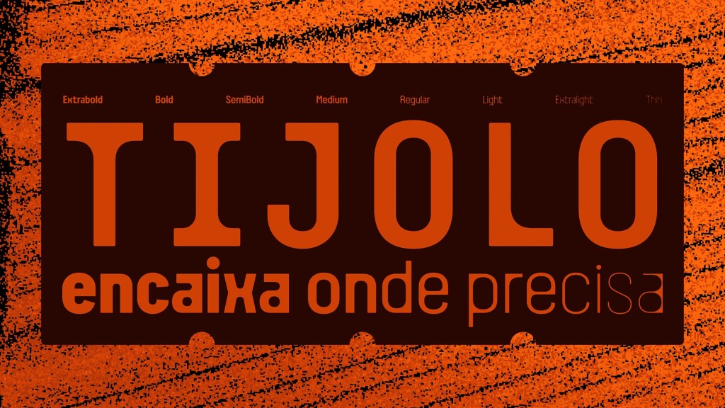
Created by Jean Rosa and Pedro Faria, Tijolo starts from Bahian bricks, cement blocks and cobogós. The variable font moves from an ink bleed effect to conventional strokes, with light weights and expressive extra-bold styles.

Courses, tools and new forms of distribution lowered the barriers to publishing fonts. The result is a more diverse repertoire, with other experiences in the drawing and a conversation less dependent on the same centers and references.
What changed
so more people
draw fonts?
How can Brazilian
typography travel
the world?
A font carries a visual accent and, at the same time, has to speak to different contexts. Going international involves characters, diacritics, writing systems, technical support and collaboration with professionals from other regions.
Plau sums up its direction as making pop typography starting from Brazil. The most interesting part is in the verb: starting. Origin does not limit reach when the project recognizes its voice and widens its repertoire.

Legibility, distinction between characters and reading comfort should be permanent criteria. The recent interest from big brands helps put the topic at the center, but it calls for caution with absolute promises. Plau itself notes that study results can be inconclusive and that some arguments work more as positioning than as proof.
For a brand, the responsible path is to test text, size, contrast, medium and context of use with real people. The design should serve reading and go beyond the accessibility pitch.
There is also room for poetic license: experimental projects can turn a cultural landmark into something tangible when the design has research, context and its own voice. That is what João Ferro explores in Timbatipo, an experimental typography project built from a Brazilian visual language.

Is accessibility
a trend
or a requirement?
Typography is visual voice
and defines how the brand
will be recognized.
Choosing a font is also deciding
how people will read, remember
and feel your brand.
My work with brands also takes care of typography.
Keep reading
-

Instagram Edits now has a desktop version: how to download it, install it and what’s new
Edits has arrived on Mac with multi-track editing, color tools and 4K export without a watermark. See the…
-

Apple Music’s new identity: designed by sound, with a very human mastery
Apple Music launched Made by Sound: logo, icon and motion shaped by frequencies in mineral oil. See the…
-

Brazilian typography in 2026: new voices, roots and global reach
Brazilian typography is growing with new voices, custom fonts and projects that recognize origin, language and authorship. See…
Discover more from BUENO DESIGN STUDIO℠
Subscribe to get the latest posts sent to your email.