
Integra/S: a platform that brings work together
Visual identity · Digital platform · Sistema FAEP
When information is scattered across spreadsheets and separate tools, management gets slower than it needs to be.
Integra/S was created to change that. It is the Sistema FAEP platform that brings together registrations, events, data, services and decisions for the Rural Unions of Paraná, Brazil, in one place.
My role was to give that system a face: a distinct, contemporary identity that kept the institutional trust of Sistema FAEP without falling into the generic look of a tech startup.

Scope
A lean scope, made for launch.
This project had a much smaller scope than usual. Sistema FAEP needed something simple and quick to launch the system, not a full brand book with dozens of pages.
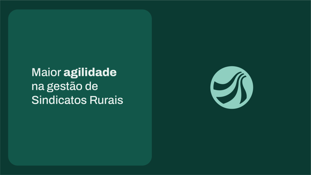
So I focused on what the launch really needed: a symbol and logo, a palette that works in the interface, typography, a quick brand guide and slide templates for presentations.
A small scope doesn’t mean less thinking. It means every decision has to earn its place.
Symbol and logo
Brand and interface palette
Archivo typography
Quick brand guide
Presentation templates
WhatsApp cards
Concept
It all starts with the S.

The main challenge was to create something new: a mark that stood out from the other brands in Sistema FAEP and was easy to recognise, without leaving the more traditional style behind.
The answer was already in the name. The S is the most valuable asset in Integra/S, and it is polysemic on purpose: in Portuguese, it stands for Sistema, Sindicato, Serviço and Solução (system, union, service and solution). In other words, it was the natural candidate for the symbol.
So I drew a softened S out of curved shapes. Each curve represents the unions, modules and services the platform organises, all moving in the same flow. The continuous stroke suggests paths that move closer and connect, without becoming the usual network cliché of dots and lines.
The circle is not just an outline. It represents the central environment that connects and organises all of these elements: unity, organisation and integration in a single shape.
The result is a symbol that communicates centralisation without illustrating technology. The identity feels technological without taking on the generic look of a startup or off-the-shelf software.
Integration without gears,
clouds or circuits.
Flow
A continuous stroke that connects points.
Curves
Unions, modules and services, organised.
Circle
The environment that brings it all together.
Colour
One colour for each job.
In a digital product, colour had to help people work better. And there was a classic problem here: green already belonged to the institutional language, but it was doing too much. It was the brand signature and, at the same time, the success signal.
When one colour says two things, the interface loses clarity. So I split the green by hue, so brand and status never share the same job.
There are five shades of the same green, each with a role: Pinheiro for covers and dark backgrounds, Integra as the signature colour, Ação for buttons and links, Menta for context on dark backgrounds and Clara for selection and highlights.
Pinheiro
#0B3A32
Integra
#12574A
Ação
#1B7A66
Menta
#8FCFC0
Clara
#EAF2EF
Type and graphics
Archivo and curves to give data some rhythm.
Sistema FAEP’s brand manual uses a geometric typeface with soft corners. For Integra/S, moving to a grotesque created the right difference in temperament: more structural, more neutral, more software.
Archivo, which also shapes the logo with small adjustments, offers great legibility in dense blocks of information, which is exactly what a management platform has plenty of.
Hierarchy comes from weight and scale: Black for covers, Bold for headings, SemiBold for labels and Regular for body text. Headings in sentence case, capitals only for short labels, because bold all-caps headings on a screen people use all day slow down reading and tire the eyes.
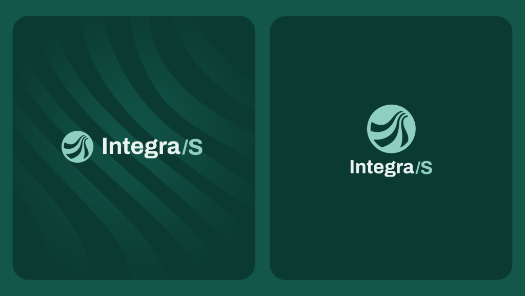
The waves derived from the symbol work as texture, always at low opacity. They fill empty space and bring a touch of organic character to a brand built around process and data.
Applications
On screen, where the work happens.
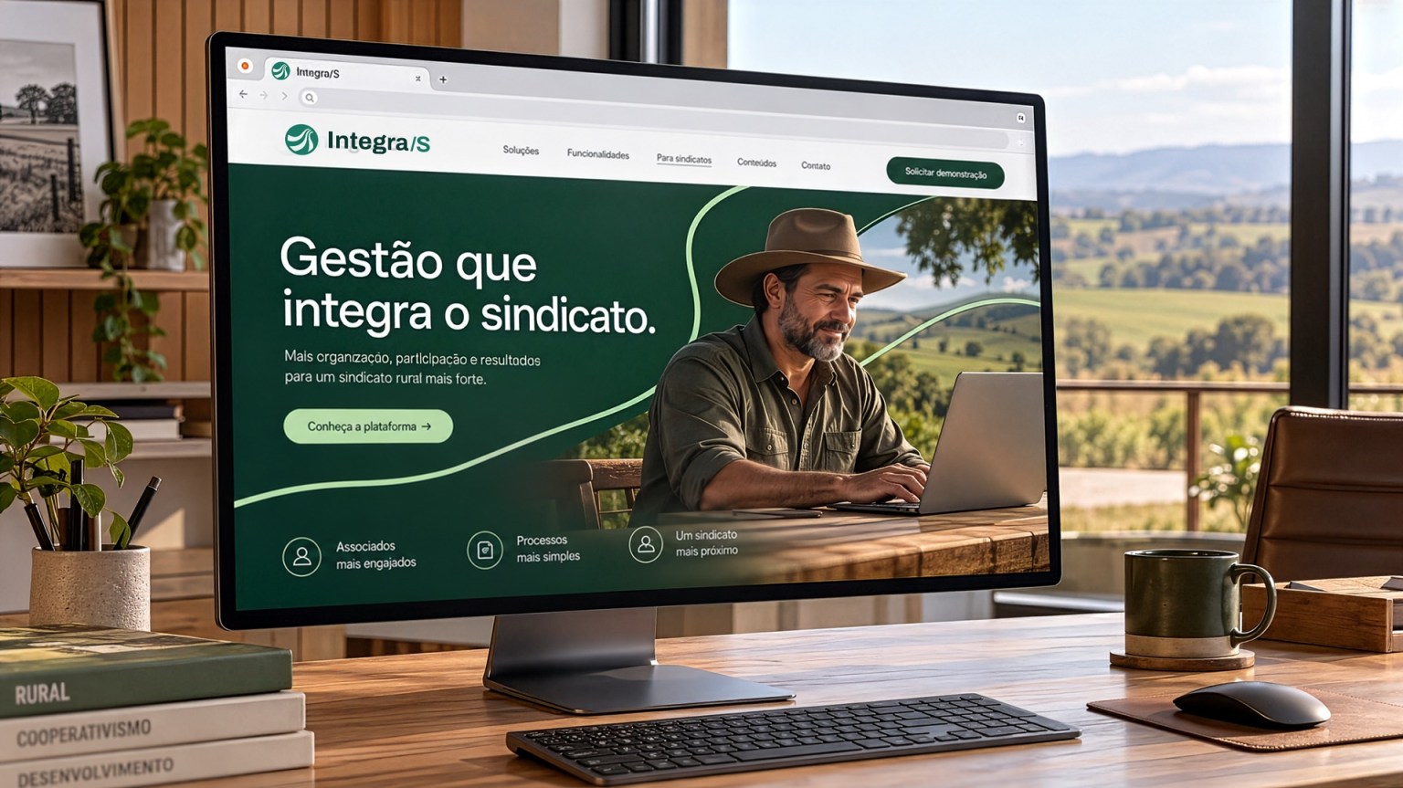
Integra/S is, above all, a tool for daily work. So the identity was designed to live on screen, where people actually spend their time.
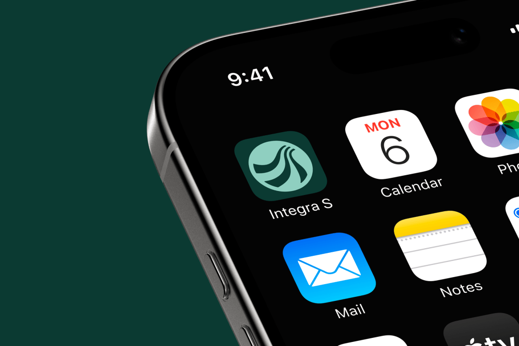
On the website, the brand introduces the platform to the unions. Inside the system, the palette organises the agenda, deadlines and statuses without competing with the information. And on the phone, the symbol becomes an app icon that stays recognisable even at small sizes.

Communication
From platform to conversation.
A platform only works if people know it exists and trust it. That’s why the identity also had to step off the screen.
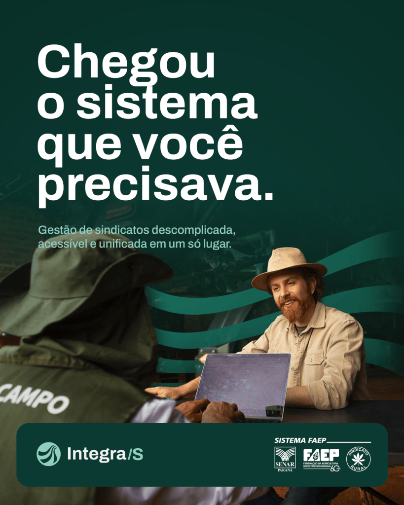
The WhatsApp cards take the message straight to the people who run the unions day to day. Photos of real people in the field, short headlines and the same mix of deep green, mint and curves.
And off screen, the brand holds up on uniforms too, with the symbol and logo on the vest, shirt and cap.
WhatsApp cards



Brand guide
A quick guide to keep everything consistent.
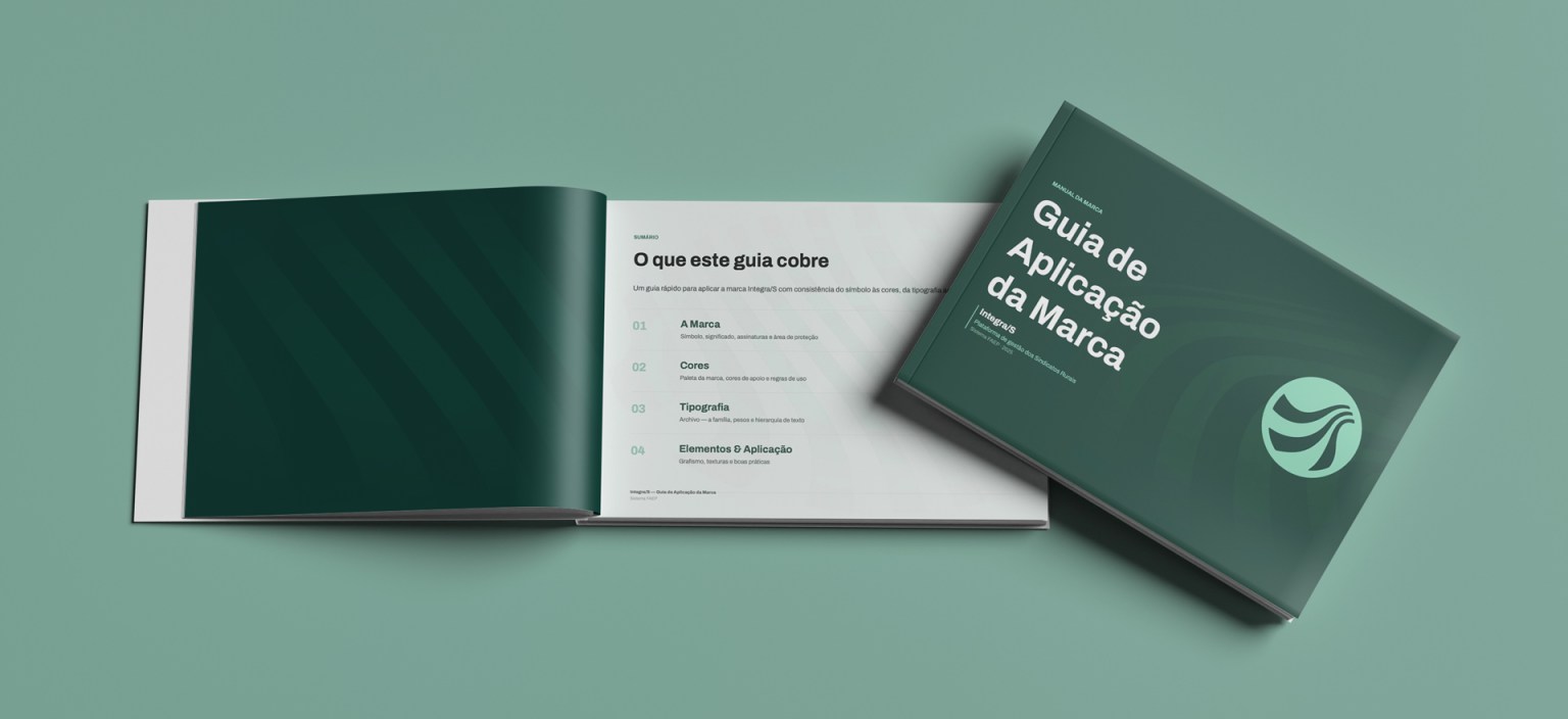
In line with the scope, the guide is short and to the point. It’s a quick brand guide in four chapters: the brand, colours, typography, and graphics and applications. Inside, just the essentials: logo versions, clear space, minimum sizes, incorrect uses and the rules that keep the palette working in the interface.
One detail I like: the symbol was designed to survive on screens, working down to 16 px as a favicon and app icon.
Alongside the guide, I delivered slide templates for presentations. That way, the team can present the platform with the identity already applied, without starting every deck from scratch.
Symbol and logo versions
Clear space and minimum size
Incorrect uses
Brand palette
Interface and status colours
Archivo typography
Graphics and textures
Slide templates
Organise to bring people closer: from platform data to conversations in the field.
Integra/S
A brand that is confident, accessible and ready to connect.
Organising a complex operation without losing touch with the people who use it: that was the goal. If your platform or digital product needs a clear identity too, let’s talk.