
Dark Sugar: a bakery with personality
Rebrand · Visual identity · Mascot · Packaging · Retail
When was the last time you ate something sweet without thinking twice? That question shaped Dark Sugar’s new chapter.
Dark Sugar is an artisan bakery and confectionery in Curitiba, Brazil, with four stores, delivery and an events arm. Everything is made by hand, from scratch, every day.
The product was already great. What was missing was communication that matched it, in a market where almost everyone promises the same thing.
And the brief had one important detail
and a massive challenge:
the logo could not change.
Positioning
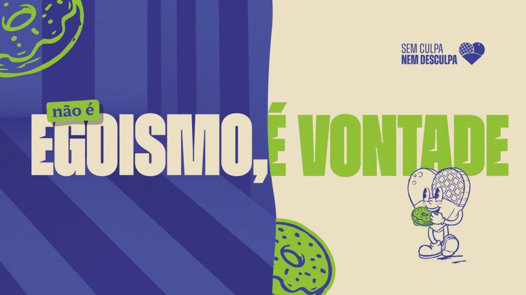
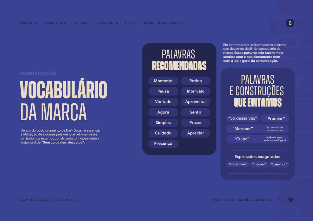
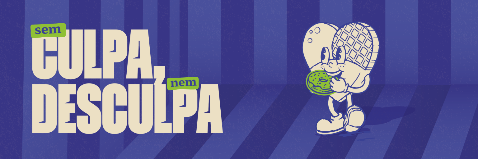
No guilt, no excuses.
Think about how often you have heard, or said, things like “I earned it, I went to the gym”, “just this once” or “I’ll make up for it tomorrow”. At some point, having something sweet turned into a negotiation.
Dark Sugar chose to stand on the other side of that deal. A good treat doesn’t need a reason: only care in the making and the desire to enjoy it.
Not every pleasure has to be a reward.
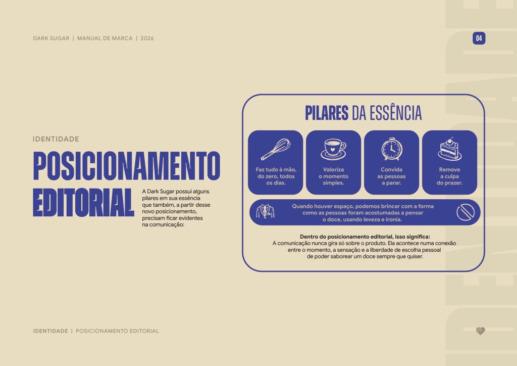
That became the backbone of everything. The communication never revolves around the product alone. It lives in the connection between the moment, the feeling and the freedom to enjoy something sweet whenever you feel like it.
Pause
Sweets as a conscious break in the day.
Presence
Being in the moment, free of distraction.
Desire
Wanting as a legitimate reason, not a reward.
The challenge
A strong brand without touching the logo.
Many people would see that constraint as a problem. I saw it as a chance to build a brand that doesn’t rely on a single element to be recognised.
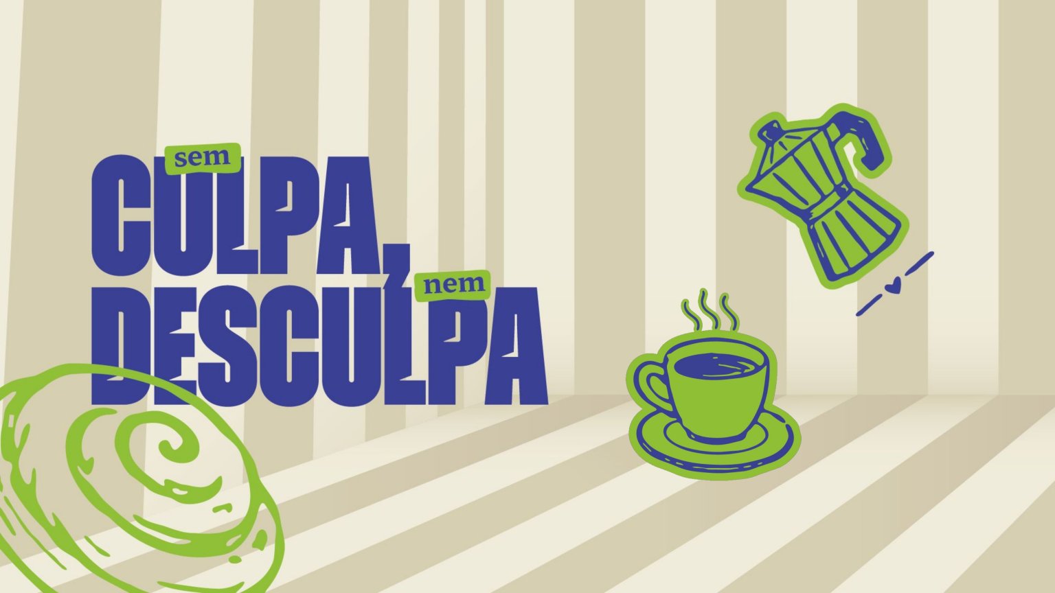
Instead of letting the logo carry everything, I created a visual language that stands on its own. Color, type, illustration, mascot, texture and tone of voice work together so every piece is recognized before anyone looks for the name.
Mascot
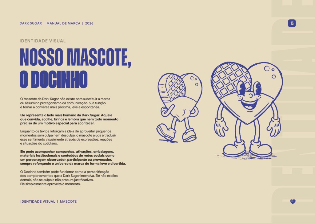
Meet Docinho.
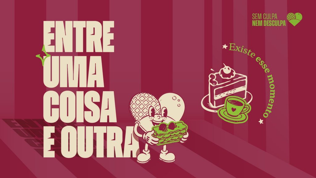
I created Docinho (Portuguese for “little sweet”) from the brands symbol, it helps the conversation feel closer, lighter and more spontaneous.
It represents the most human side of Dark Sugar and shows up in campaigns, packaging, retail and social media. Sometimes as an observer, sometimes as a participant, sometimes as a provocateur.

Visual language
Recognisable without a signature.
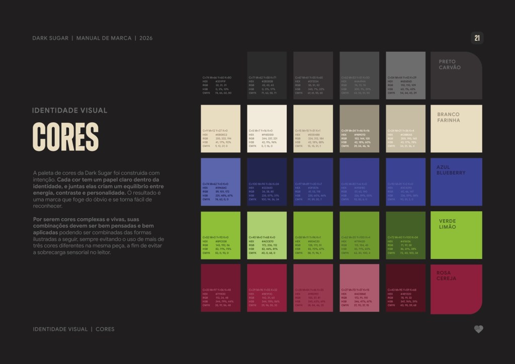
For the brand to work properly, every element needed a personality of its own. The palette pairs Blueberry Blue, Lime Green and Cherry Pink with two neutrals, Flour White and Charcoal. These colours grab attention in the shop window as well as in the in the feed.
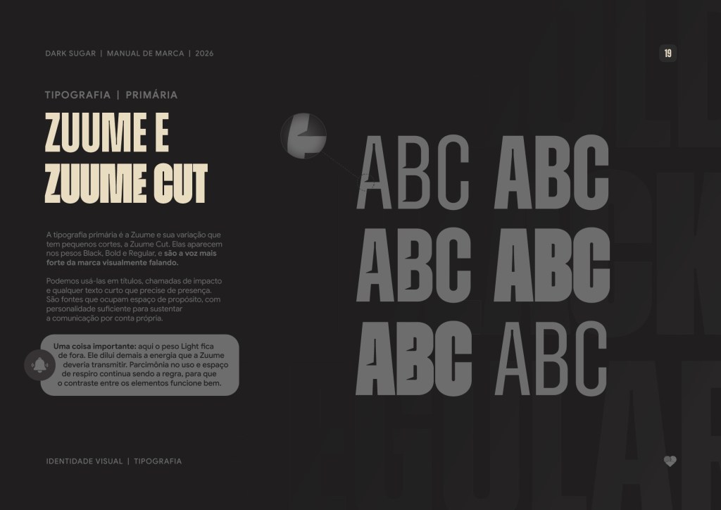
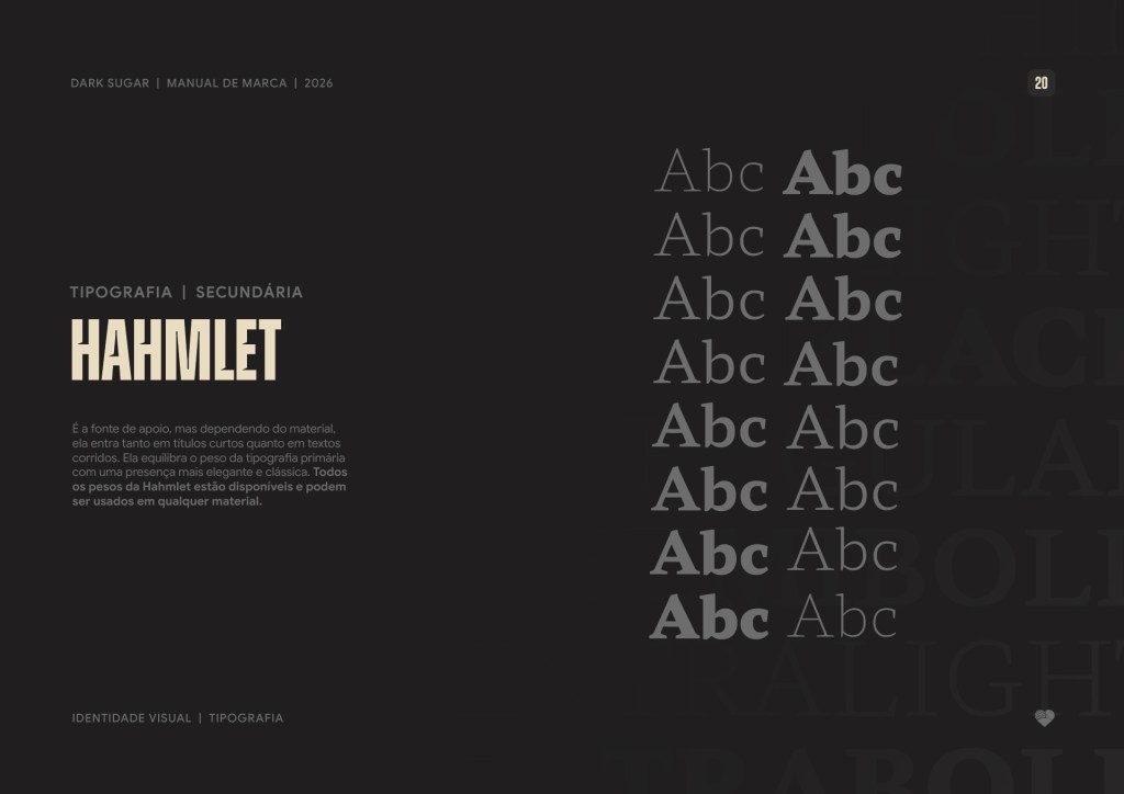
For type, Zuume and Zuume Cut (a variation with small notches) take over headlines and calls to action. They are condensed typefaces that take up space on purpose. The Light weight was left out because it diluted the energy the brand needed.
Blueberry
Blue
Lime
Green
Cherry
Pink
Flour
White
Charcoal
Grain, graphic noise and slightly worn backgrounds complete the system. They create a universe with a hand-printed feel, as if every piece had gone through screen printing or a rubber stamp.


Social media
From feed to campaign.
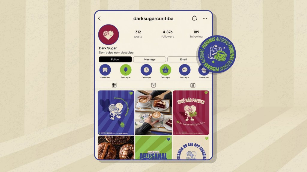
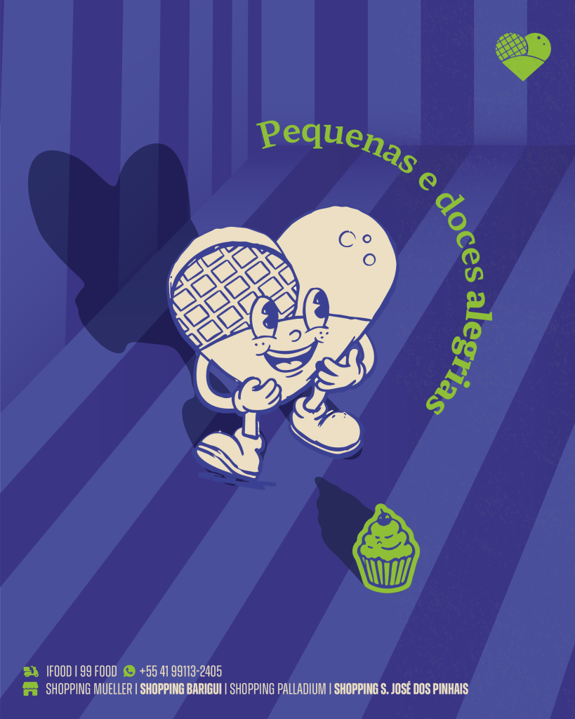
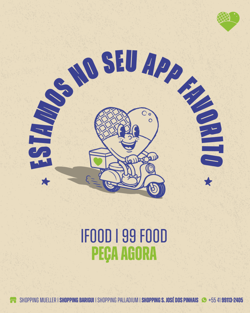
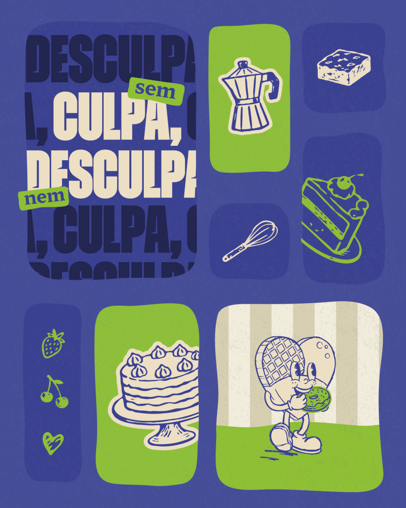
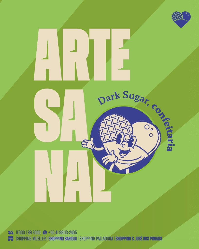
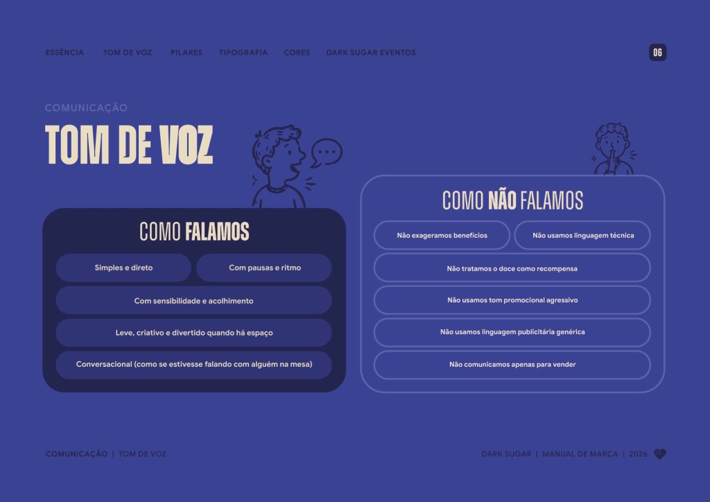
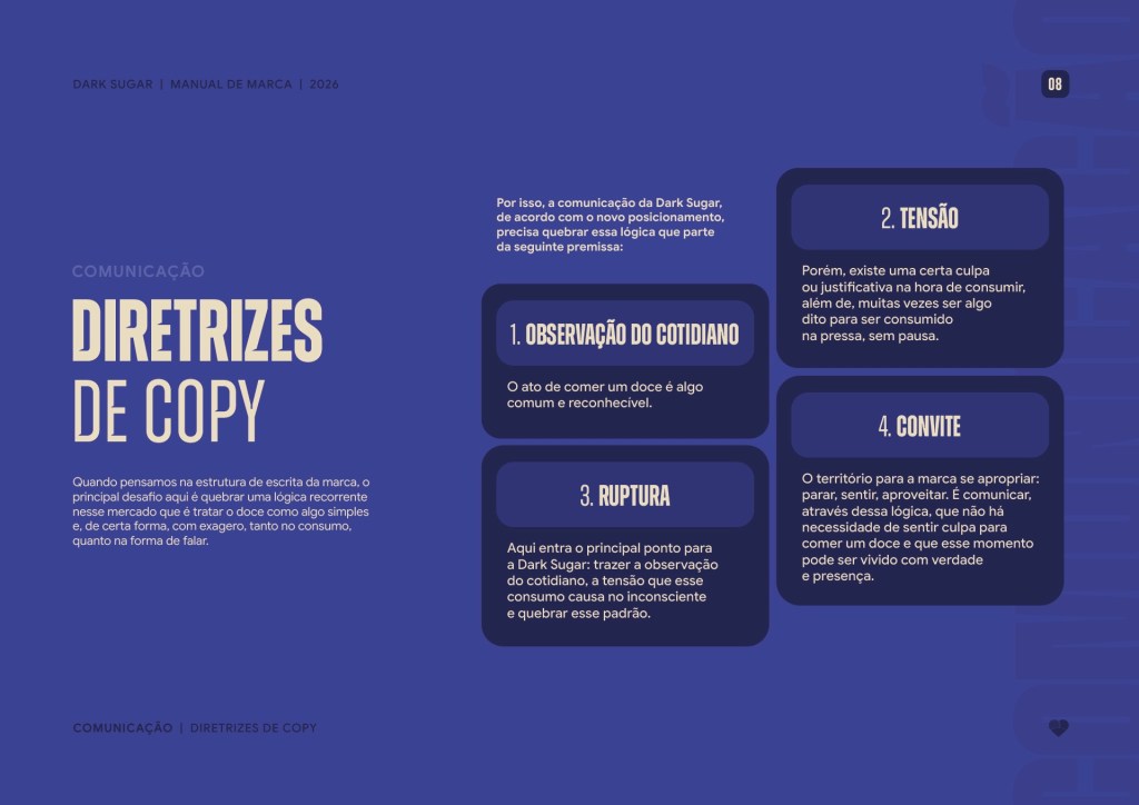
On social media, the idea was to stop thinking in isolated posts and start thinking in conversation. Short lines, a little irony and Docinho in everyday situations.
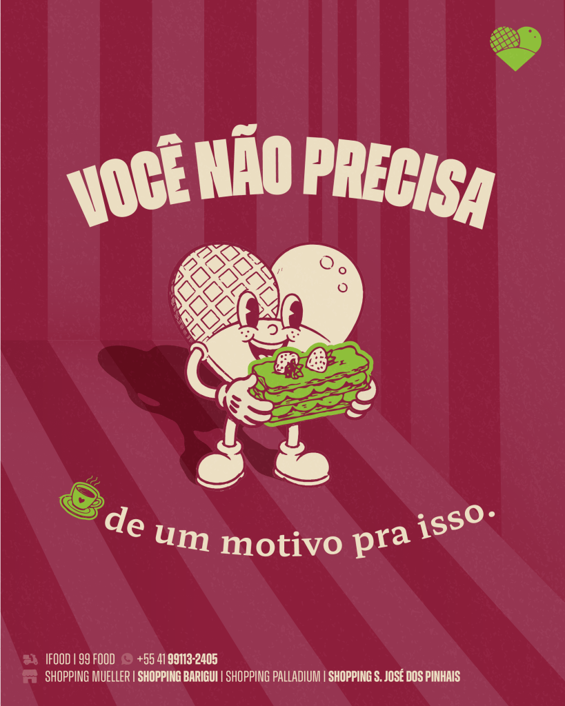
“You don’t need a reason for this.” “A short break already changes the day.” Every piece repeats the same invitation: slow down for a moment and enjoy it, guilt free.
Social media posts

Packaging
Every order becomes a small moment.
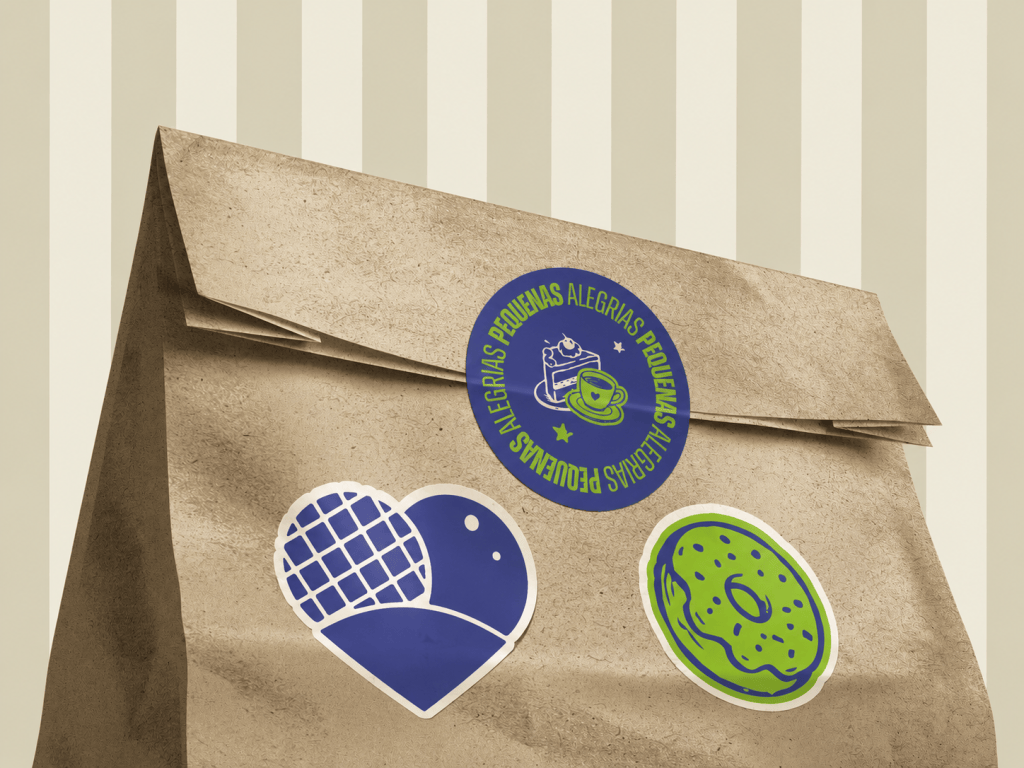
Packaging is often the first physical contact with a brand, especially with delivery. So it had to do more than protect the product.
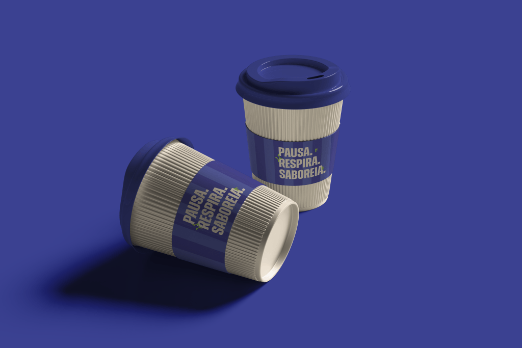
Boxes, bags, cups and stickers put the brand’s lines in the customer’s hands: “it’s not weakness, it’s just a moment”, “pause, breathe, savour”. Small reminders that this treat needs no excuse.


Uniforms and space
The team wears the idea.
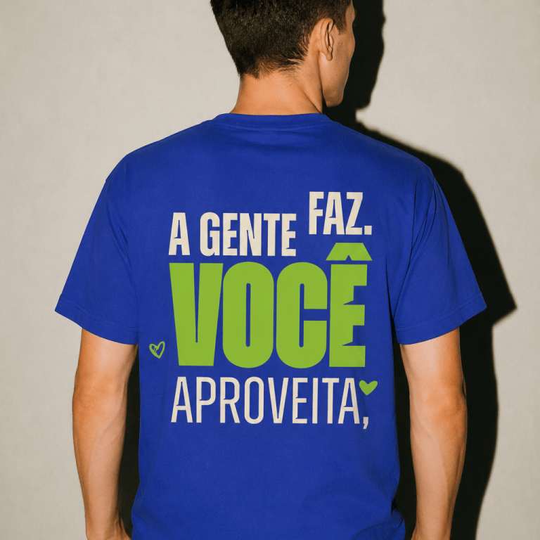
Uniforms are among the most visible pieces in a store, and they are almost always treated as an afterthought.
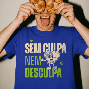
Here, the T-shirts carry lines such as “we make it, you enjoy it” and “no guilt, no excuses”, in blue and Flour White versions, with cap and apron. The team becomes part of the communication, not just the service.
The decorative frames follow the same logic: “bye guilt, nobody looks back here”, “stay a little longer”, “coffee turned into conversation”. Lines that turn the wall into part of the experience.

Carousel · Uniforms

Decorative frames 30 × 30 cm



Retail
The store speaks too.
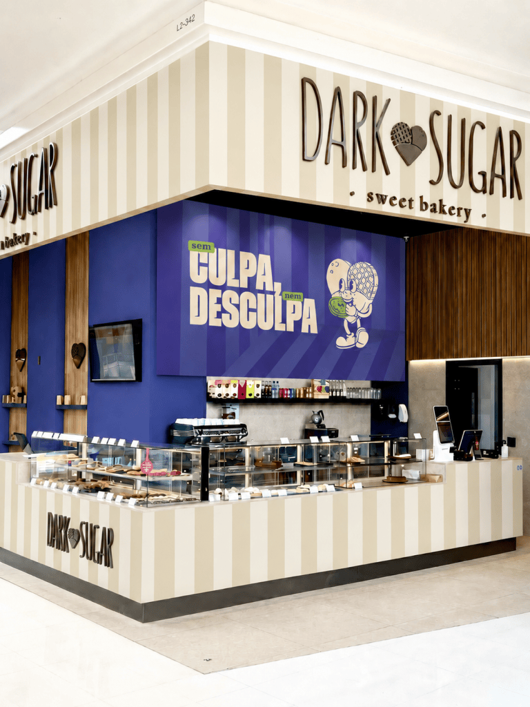
With four stores in shopping centres across Curitiba and São José dos Pinhais, retail is where the brand gains scale. It is also where it competes with dozens of other shop windows.
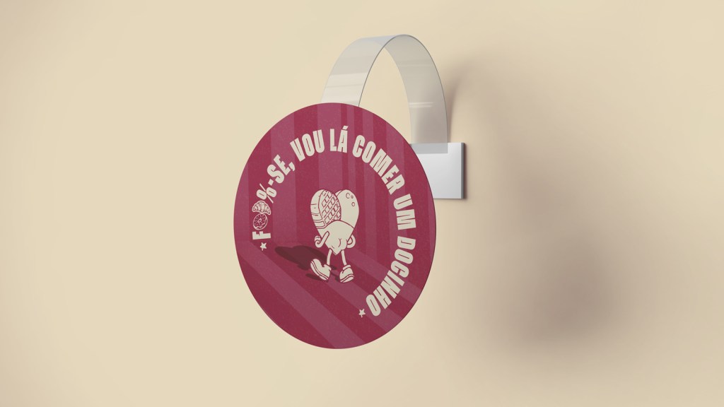
I designed the store environment so the brand could be recognised from a distance and in a way that it was possible to change the look on a small budget: vertical stripes, blue as the dominant colour and Docinho on panels, displays and wobblers. At the counter, table displays carry the brand’s humour: “guilt? I’m out!”, “grabbing my treat and heading off”.
Store environment

Events
Same voice, different menu.
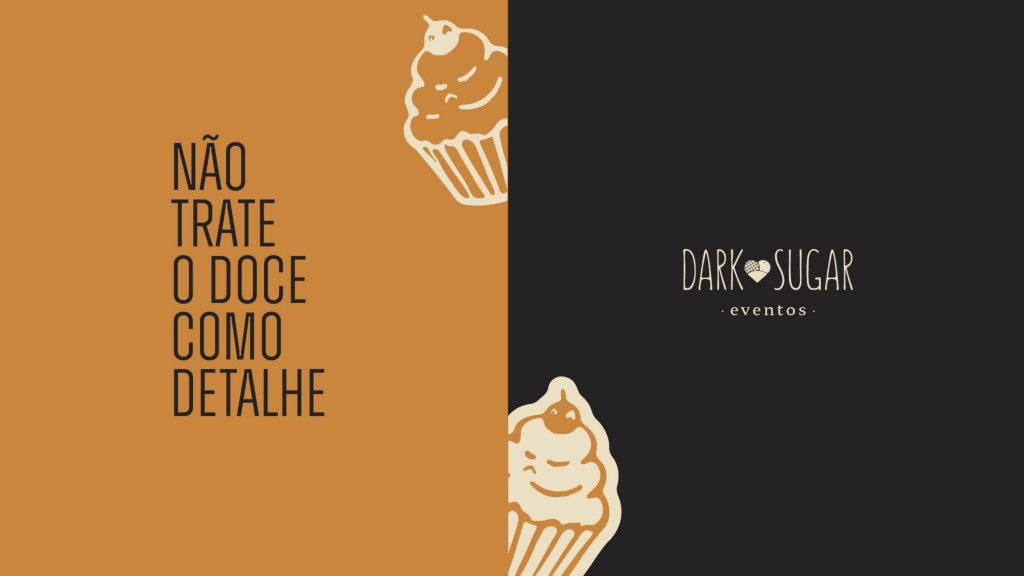
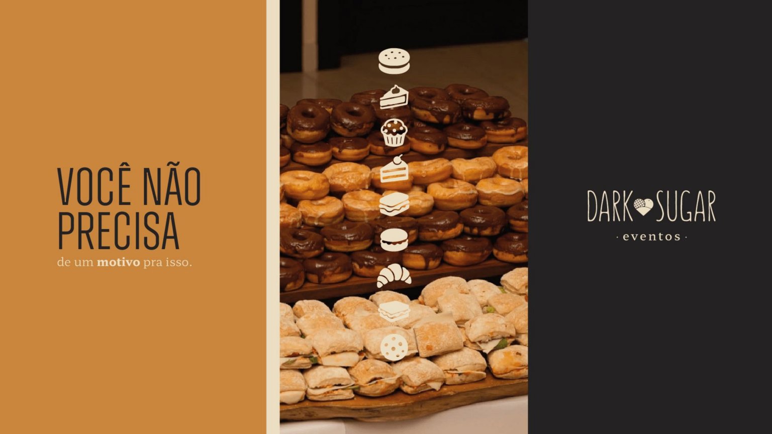
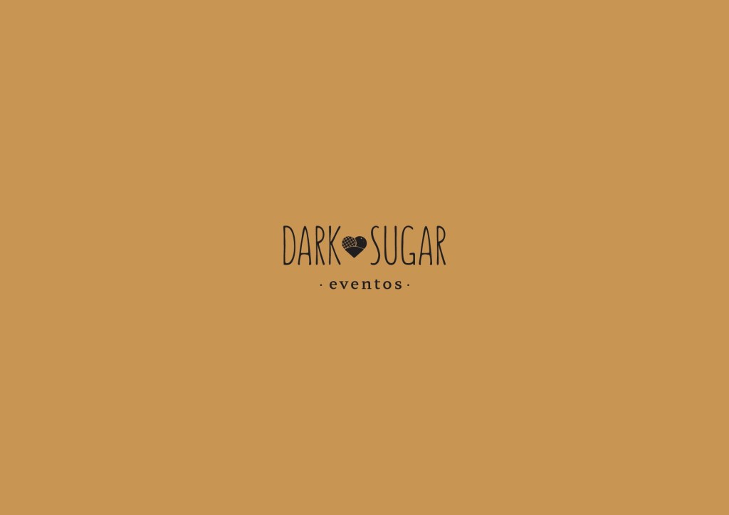
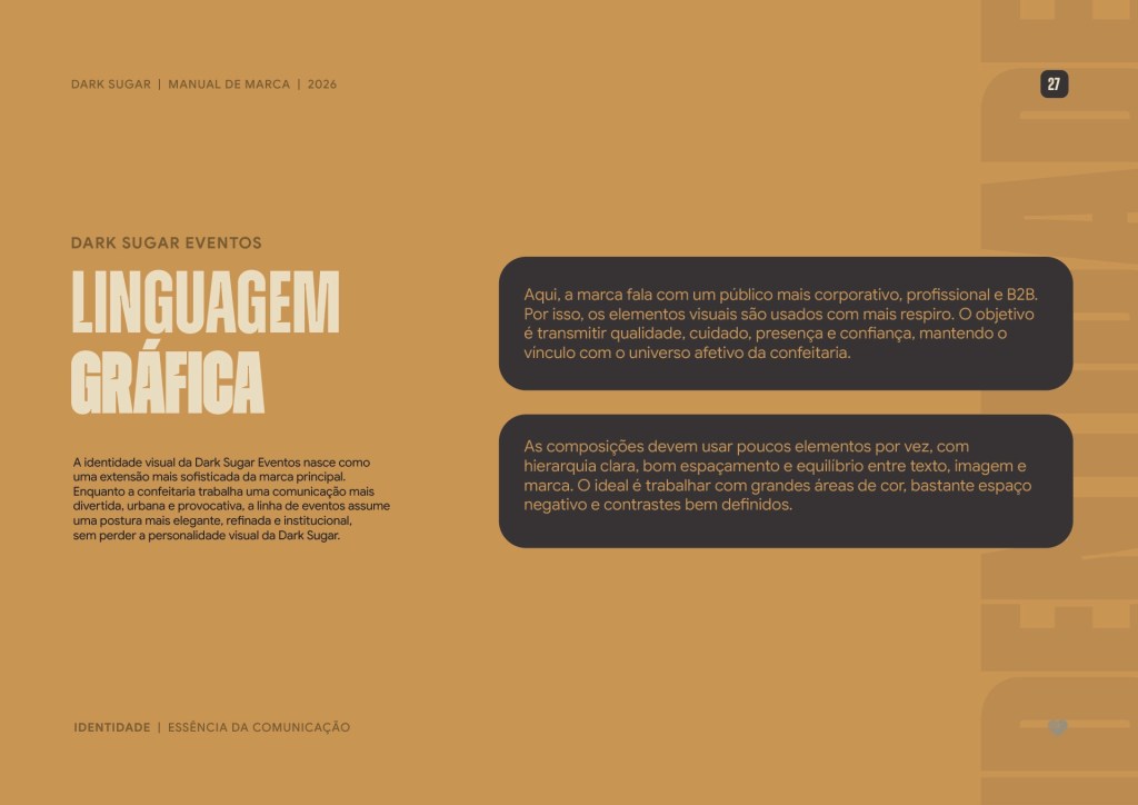
Dark Sugar also caters corporate and private events. For that side of the business, Dark Sugar Eventos received a more understated version of the system.
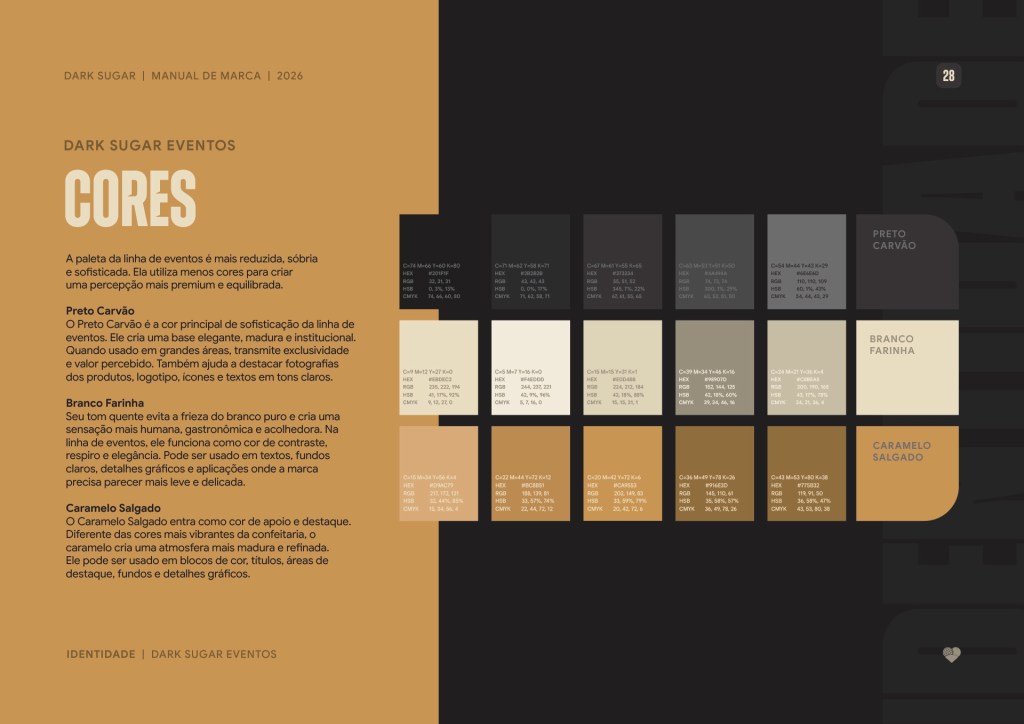
The palette swaps the retail colours for Charcoal Black, Flour White and Salted Caramel, better suited to a B2B context. The attitude is still there, though: “don’t treat dessert as a detail”.
Design elements
Illustrations that move.
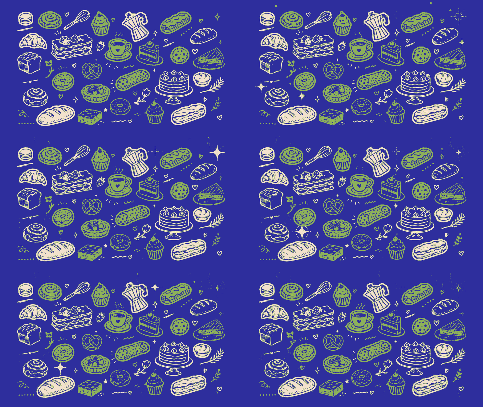
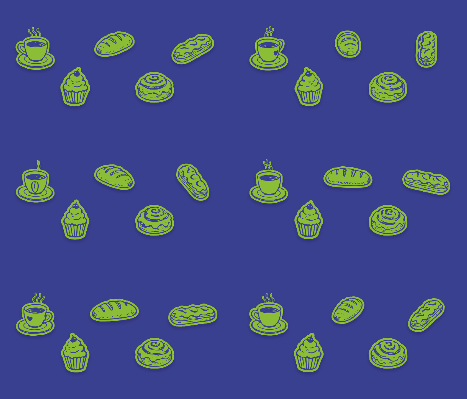
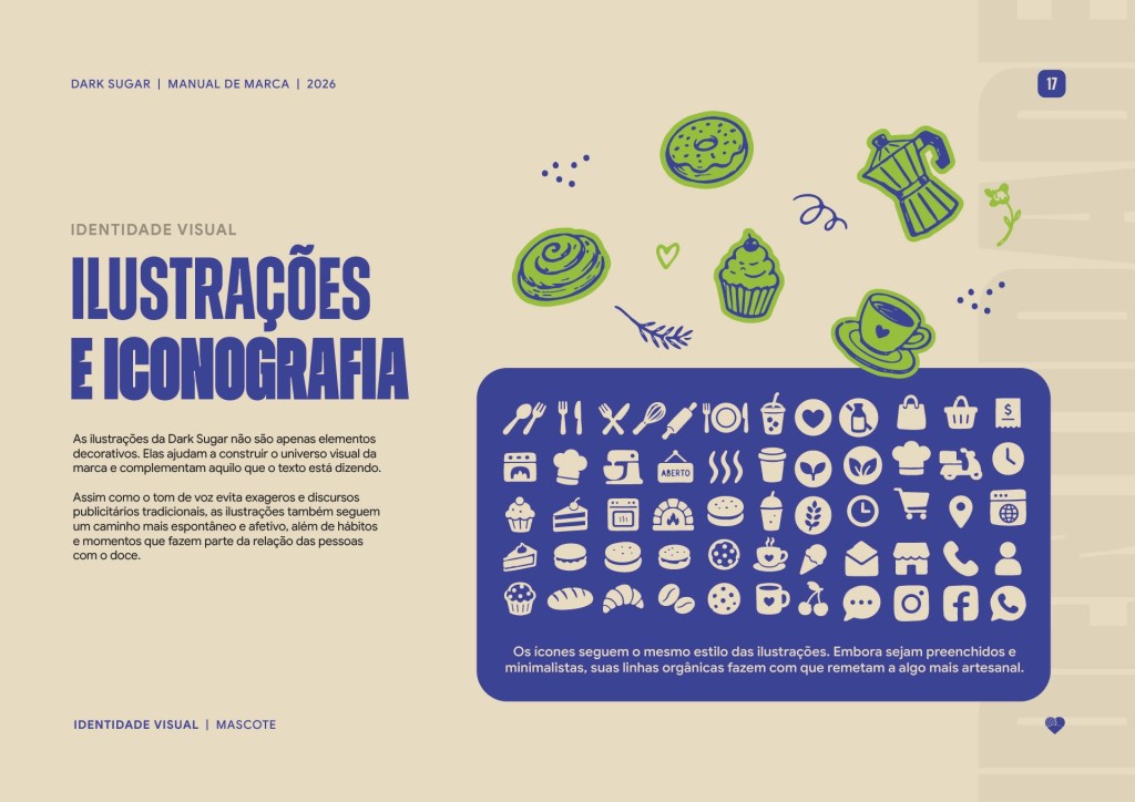
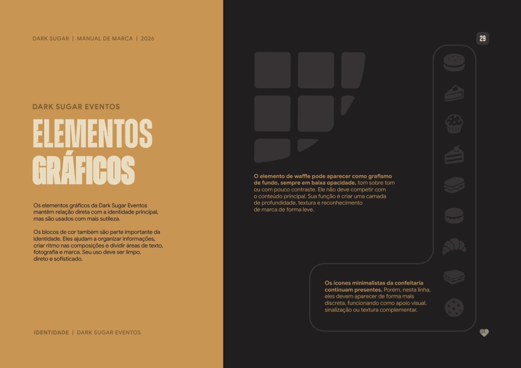
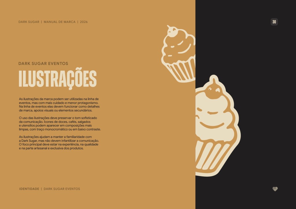
Dark Sugar’s illustrations and iconography help build the brand’s world and complement what the copy is saying.
In motion, they gain even more personality. Coffee, cupcake, bread, cinnamon bun and sandwich became short animations.

Brand book
A guide made to be used, not shelved.
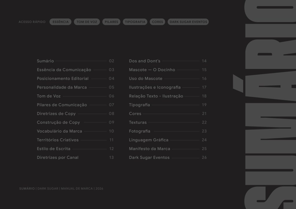
We brought together editorial positioning, communication pillars, mascot, colours, typography, textures, illustrations and photography direction in a guide built for the day-to-day work of whoever creates content for the brand. That way, Dark Sugar can grow into new products, stores and channels without losing its touch.
Editorial positioning
Communication pillars
Docinho mascot
Colour palette
Typography
Textures and atmosphere
Illustration and iconography
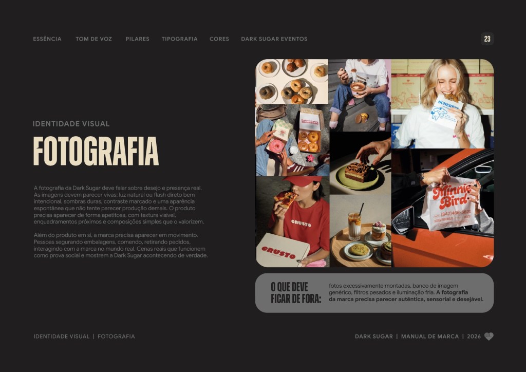
Photography direction
Packaging
Point-of-sale materials
Social media
swipe and have a look at the Brand book




A good treat needs no excuse. Neither does a well-built brand.
Dark Sugar
No guilt, no excuses and plenty of personality.
Brand identity is about being recognized in every detail, from a simple message on social to the donut box and the team uniform. If your brand needs that too, let’s talk.
Project Credits:
Visual Concept & Art Direction: Maichel Bueno
Creative Concept & Copywriting: Igor Pagliuso
Strategic Planning: Mariana Machado
Account Management: Laís Mota Plácido
Head of Creative: William Balbueno
Creative Direction: Ricardo Mercer
Agency: CandyShop