
Agência 110: rebranding and visual identity that are far beyond a new look.

Brand rebranding · Visual identity · Art direction
A story spanning more than 16 years
didn’t need to look new. It needed
a form worthy of what Agência 110
already delivers.
Strategy, speed and the drive to go further.
The rebrand didn’t start with a color or
a symbol. It started with a simple question:
how do you make a digital marketing
agency that never settled for the ordinary more visible?
Positioning
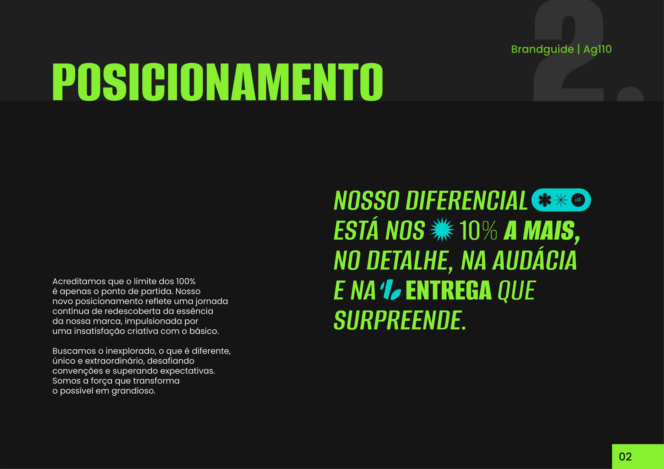
We don’t do basic.
100% is the start. Agência 110 exists for those who understand that digital marketing can’t be just presence: it needs direction, repertoire and results.
Challenge the ordinary, optimize results.
In the repositioning, I sought boldness to create what doesn’t go unnoticed, organization to keep the brand running, and results to give direction to every choice.
Boldness
Ideas that don’t go unnoticed.
Organization
Enough method to keep the brand running.
Results
Creative decisions that know where they’re headed.
Symbol
An abstract
or representative
symbol?
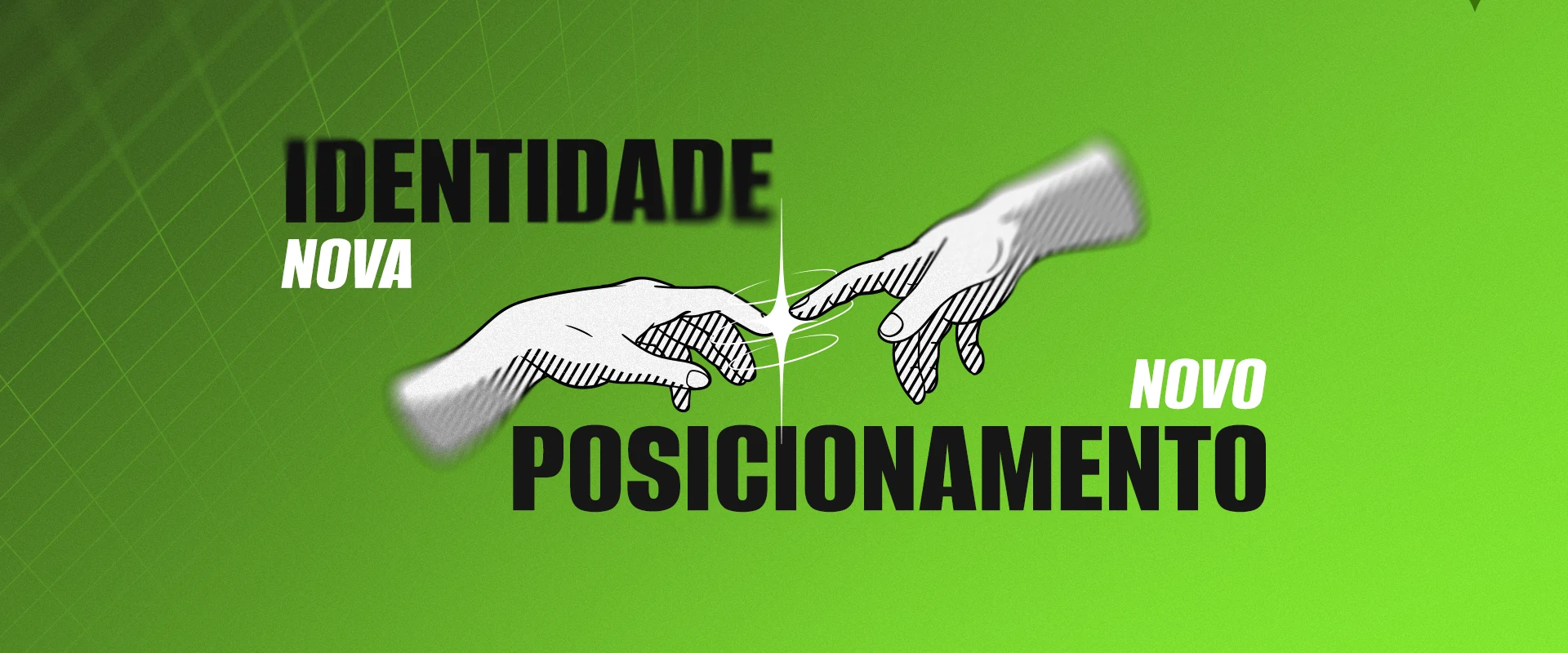
The new symbol I created was inspired by a well-known character, used since the late 15th century, first in commercial matters such as calculating interest, profits and taxes.
Here it takes on a new perspective, different and modern. A simple character becomes a design element that says a lot about us.
It reminds us of the core of our business: a symbol that, for us, means going further, reaching that extra 10% that makes us embrace the future.
Colors
A new palette,
modern and
striking.
Distinct, dynamic,
adaptable and versatile,
they bring modernity, technology and freshness
to the new visual
identity. Colors I chose
to create impact and grab attention at first glance.
#111111
#262626
#F2F2F2
#00D3CD
#87F031
#4000F5
Typography
Typography striking enough to touch the future.
Alumni Sans
One font, many styles, endless range
After a lot of research and testing, I found a high-quality, modern typeface that’s completely free on Google Fonts. Versatile enough to carry a voice that won’t settle for the basic.
Secondary · Poppins
The simple one that does it all
The secondary typeface I chose is geometric and rounded, which makes it easy to read in any context.
Design elements
Portals beyond the merely ordinary.
The tech, retro-futuristic portals are design elements that work as part of a visual narrative that builds unity with the story of a new future: modern, technological and exciting.

Internal comms
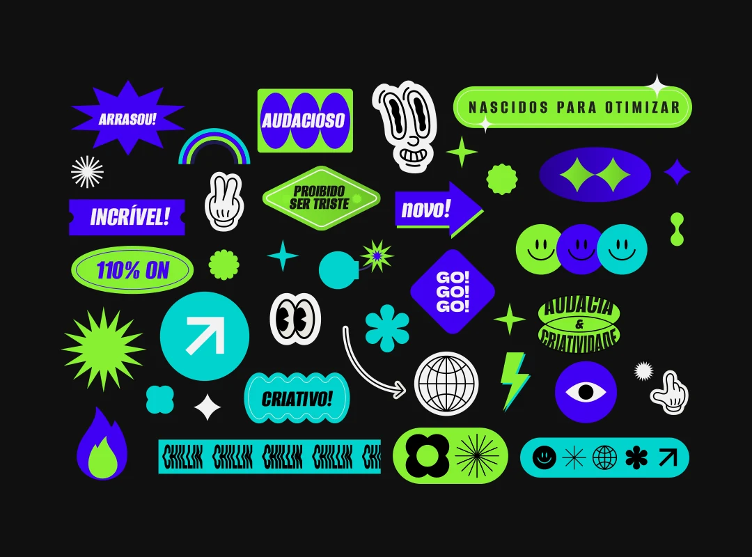
A sticker pack
to lighten things up.
I created a few stickers for internal communications and for posts and stories that call for a more relaxed tone. They’re consistent with the look I was after, but should be used sparingly so they don’t clutter the designs.
The wordmark
Bold,
unique,
timeless.
The wordmark is friendly and approachable. I tweaked the forms slightly to contrast with the more abstract lines of the symbol, and the weight difference helps readability.
A BRAND THAT WON’T SETTLE FOR THE ORDINARY DESERVES
A DELIVERY THAT GOES FURTHER, AND I DELIVERED!

Rollout
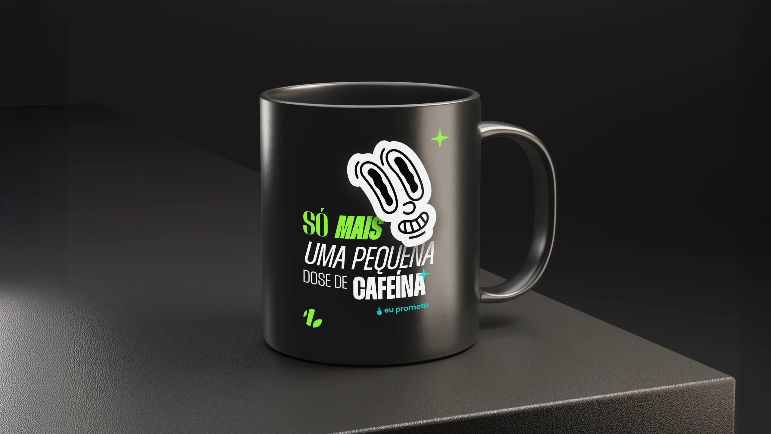
The brand needs to exist beyond the screen.
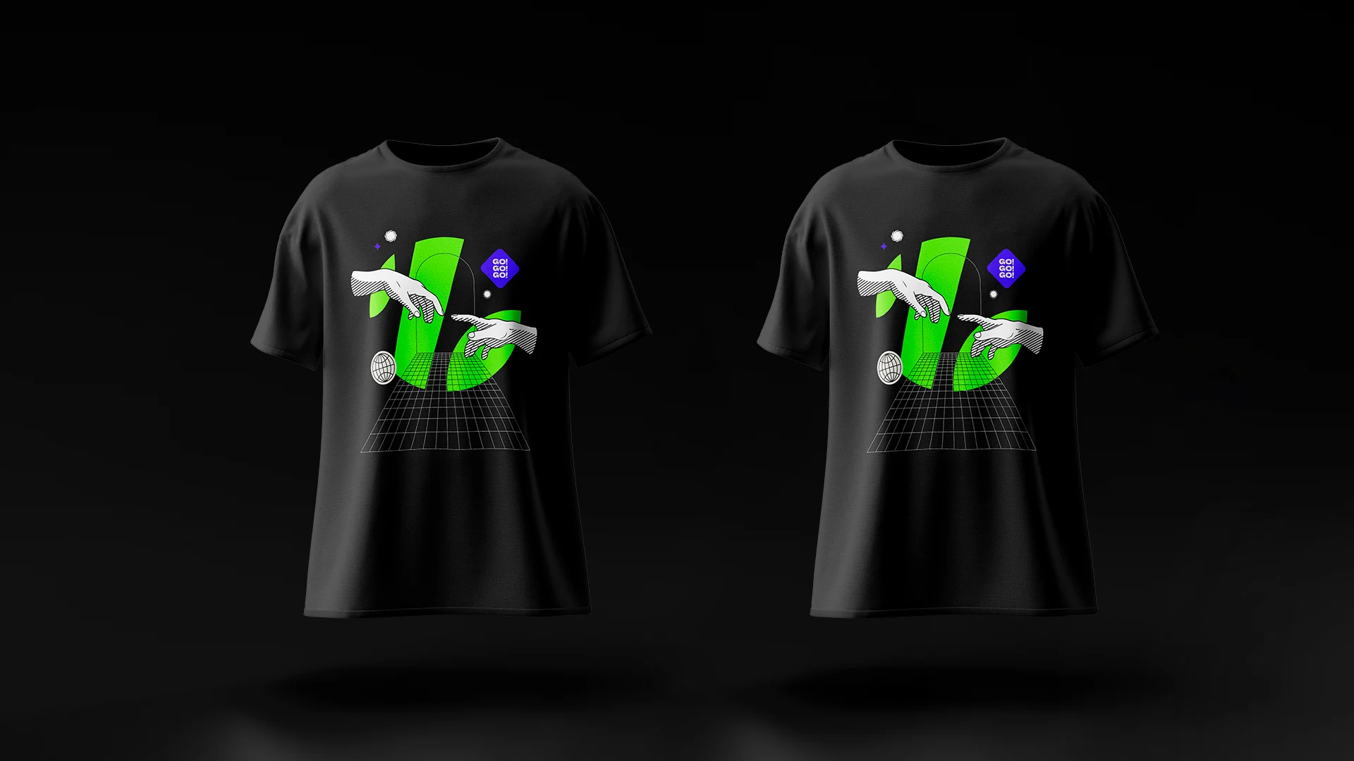
A rebrand only gains strength when it hits the street,
the campaign formats, the meetings and the conversations.
That’s why I designed the rollout as
a natural extension of the brand system.

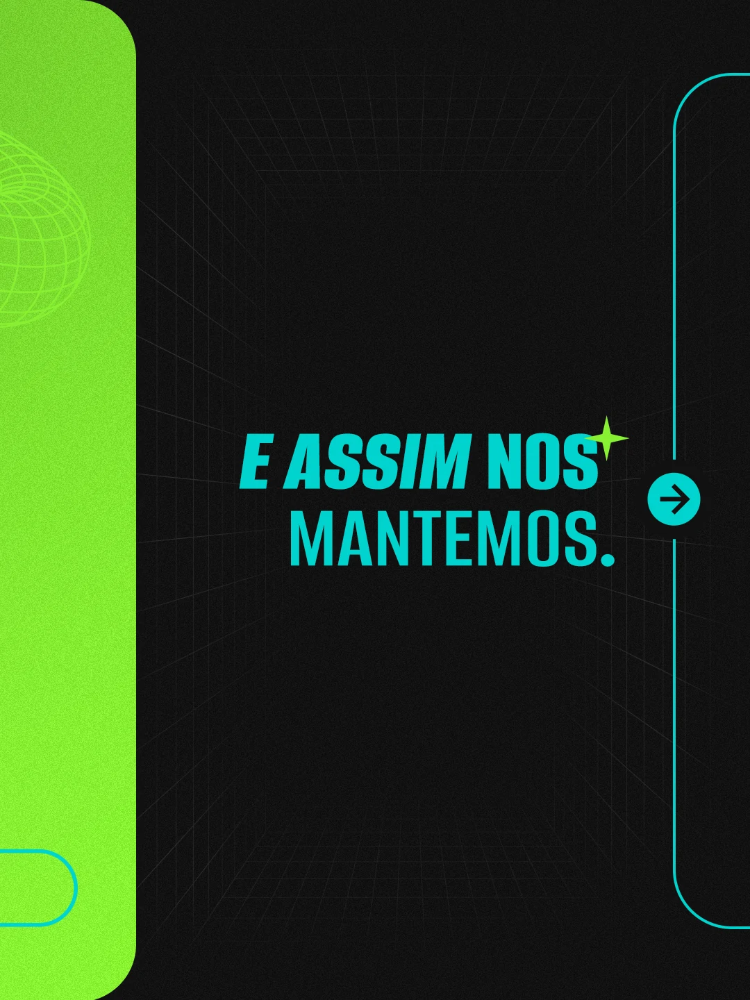
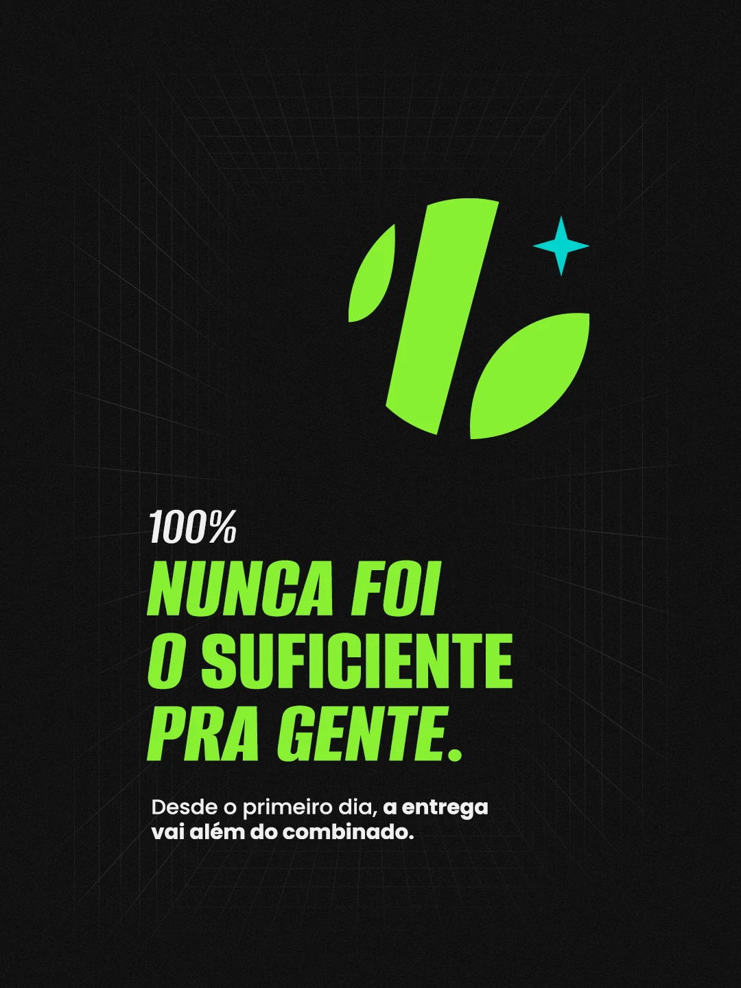
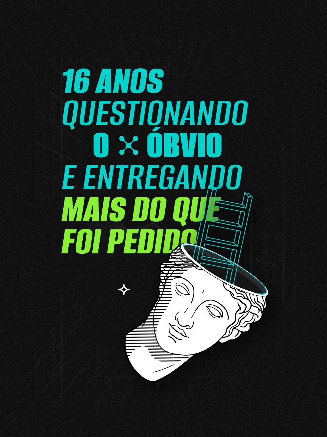
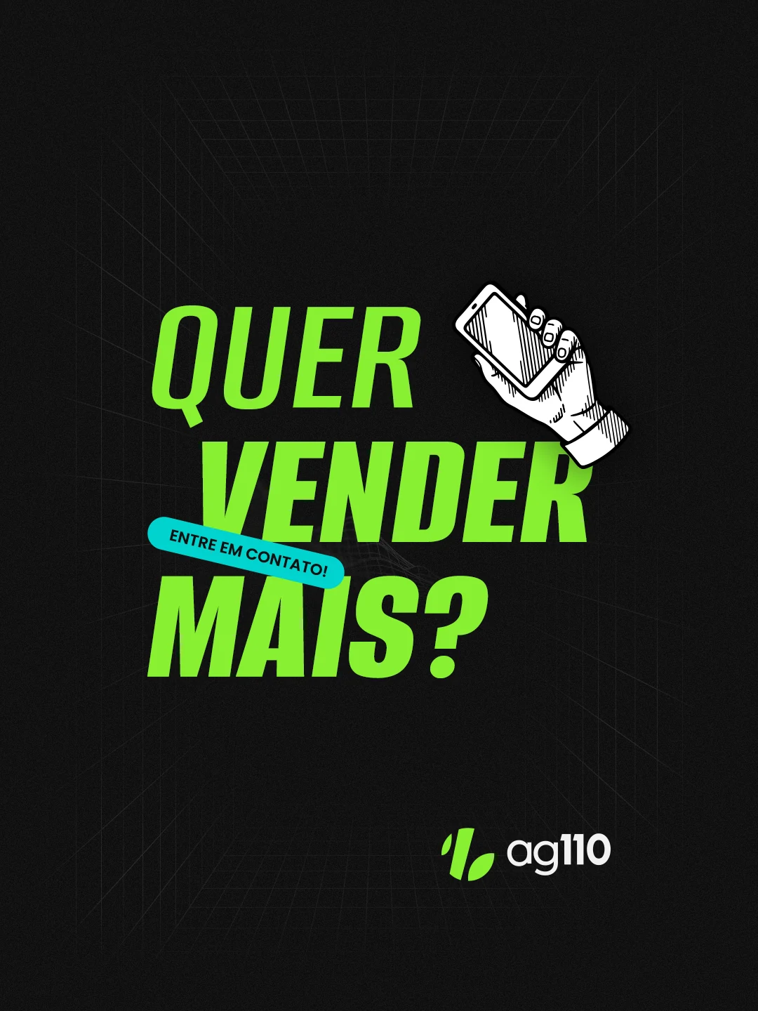
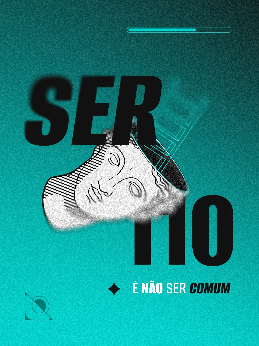
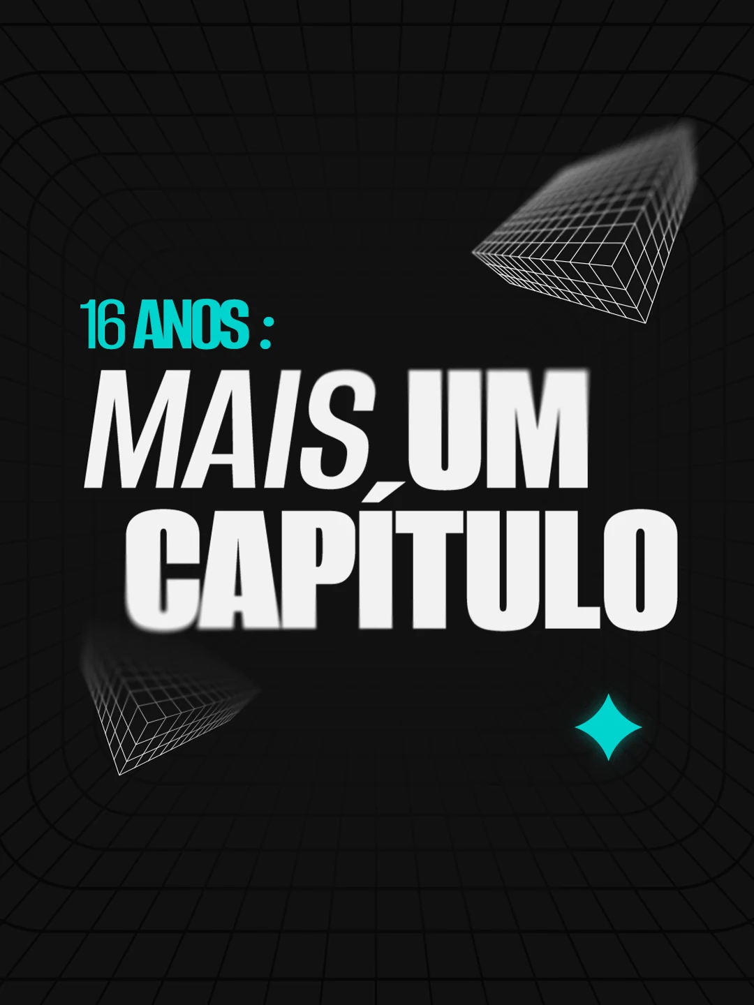
Carousel · About us



Carousel · Services

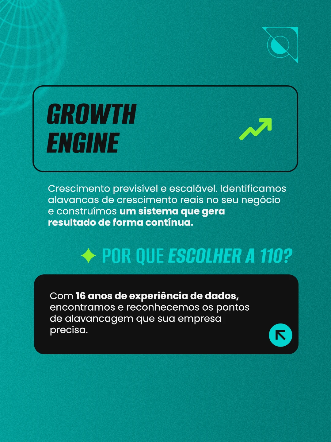


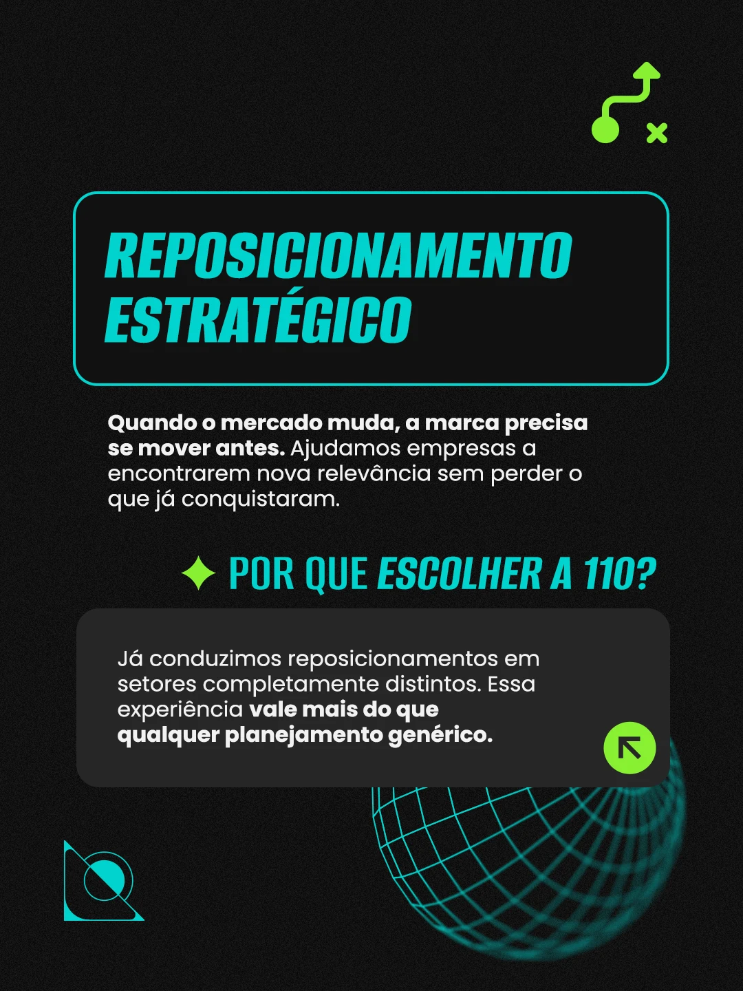


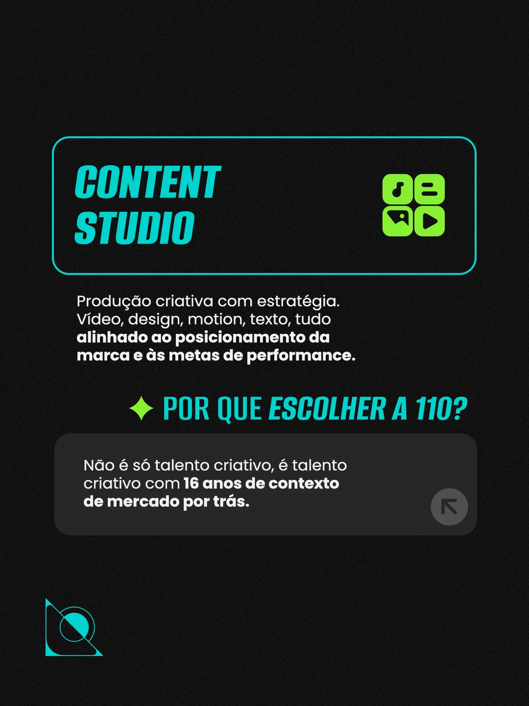
Launch posts
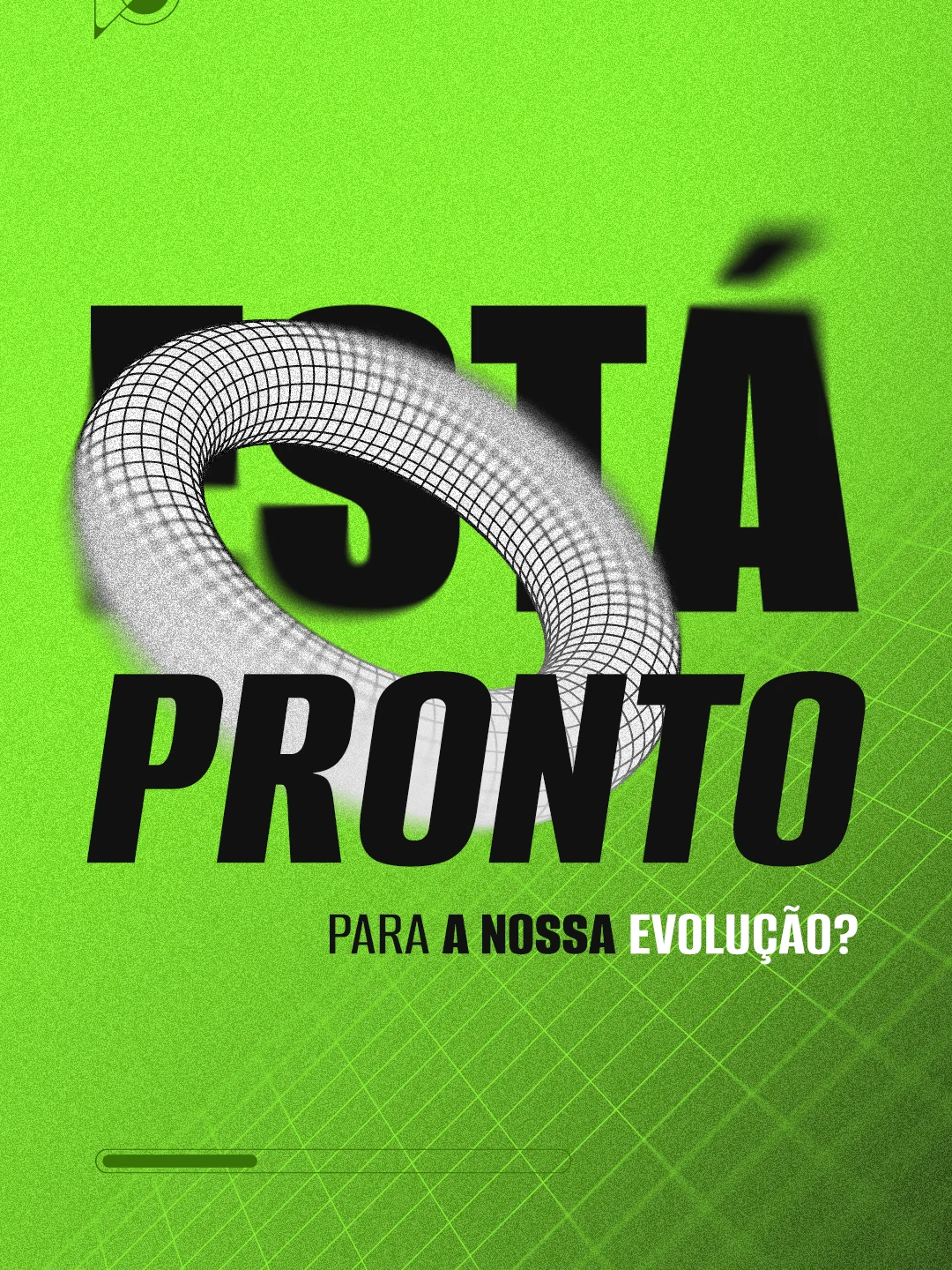



Motion
A new era calls for movement.
At launch, I carried the new language into social with
campaign rhythm: teaser, manifesto
and a brand system in expansion.
I planned a sequence that makes sense seen together
and also when each piece stands alone in the feed.
Design System
A complete, robust system.
To keep the brand consistent, the brand system was delivered well organized: an open file with all the elements, backgrounds, stickers and a short guide for generating elements with A.I. Everything organized in my own method, built and refined over 8 years of art direction for brands.
Presentation templates
Grids
Folder structure
Motion design guide
Iconography
Visual elements
Backgrounds
Prompt for generating elements
Color usage guide
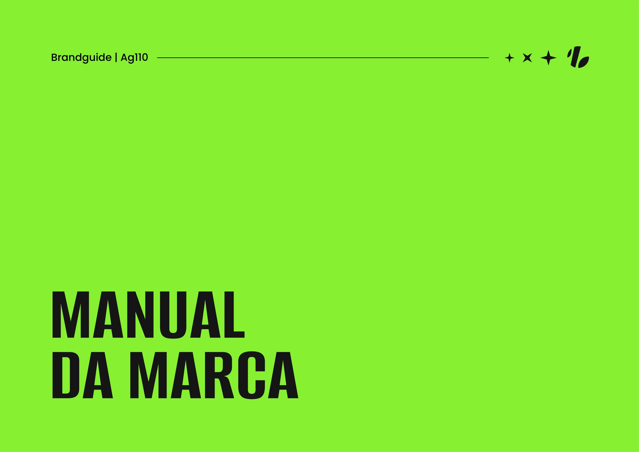
Brand manual
Brand manual
The manual is part of the brand too.
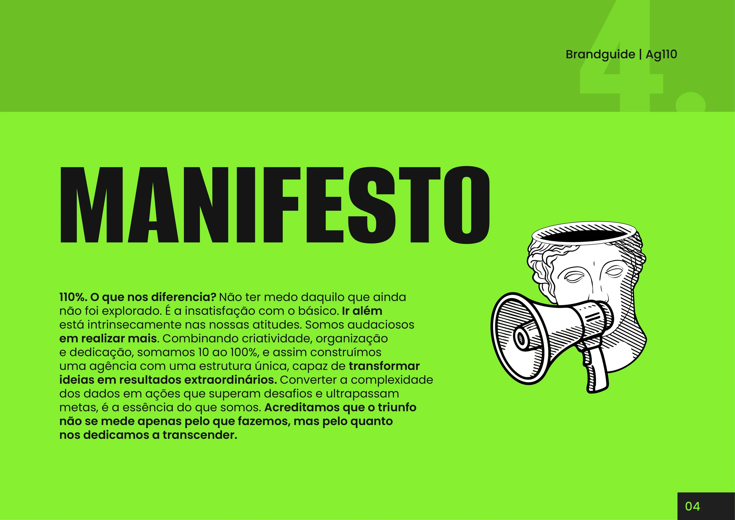
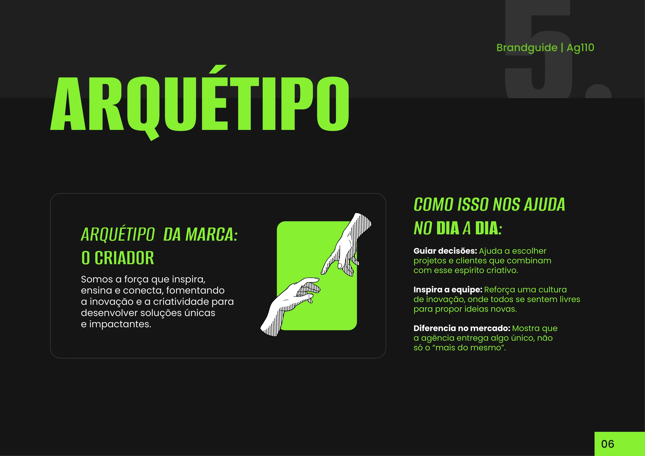
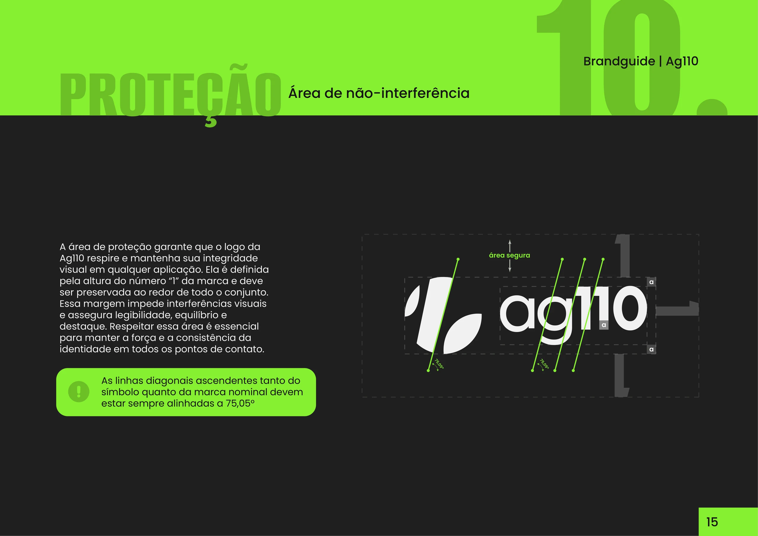
More than recording rules, the manual organizes possibilities. I built a complete design system so Agência 110 can grow and behave without losing its touch. It brings together the graphic elements and backgrounds, as well as a color-usage guide and the visual directions and tone of voice for internal and external communication.
Brand manual




Agência 110
A new look. The same drive to go further.
Identity isn’t the finish line. It’s the start of a clearer brand, ready to take the next space.