
ADVB Personalities Award 2026: art direction and visual identity

Art direction · Visual identity · Event
How do you design the identity for a night that celebrates people without falling into the usual gala clichés?
In 2026, the ADVB/PR Personalities Award reached its 9th edition. It is the night when ADVB, the Brazilian association of sales and marketing executives, honours leaders and professionals in Paraná for their work, their achievements and their contribution to the state’s development.
I led the art direction in partnership with CandyShop, with the concept created together with the copywriting team. The challenge was to give the Award presence without letting the identity steal the spotlight from the people being honoured.

Concept
Recognise. Connect. Build.
The Award has two sides. One is the tribute: looking at careers that have already become a reference. The other is the gathering: bringing together, on the same night, the people who are building what comes next.
The concept brings both together in three verbs: recognise what has been done, connect the people in the room and build new possibilities from those connections.
When recognition becomes an invitation, the identity stops being just a nice frame and starts saying why it is worth being there.
Recognition that becomes
a meeting point.
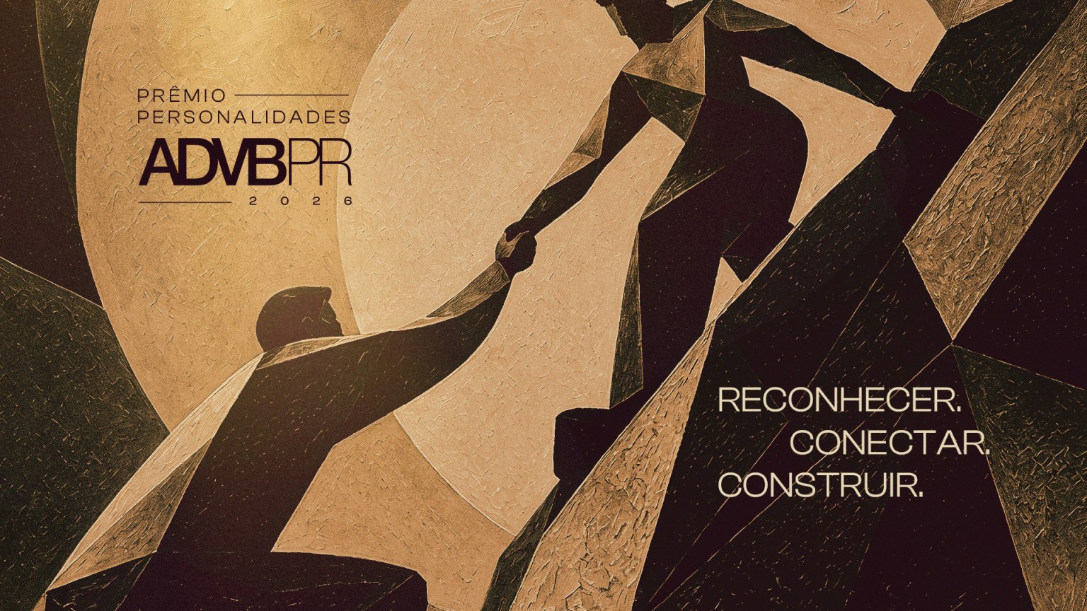
Illustration
People pulling each other up.
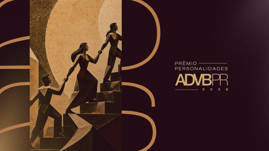
For the illustrations, I went with a cubist language. Fractured planes suggest different angles and paths, and the figures are expressive without becoming literal portraits of anyone.
The scene repeats in variations: people holding hands as they climb stairs and slopes, one helping the other reach higher. In practice, it is the concept drawn out: nobody builds a career alone.
The images were developed with the support of AI and a mix of techniques, always guided by the same art direction. The painterly texture adds materiality and keeps the result away from the generic look of generated images.
Art direction
Prestige without excess.
Awards tend to lean on black with shiny gold, champagne glasses and spotlights. Personally, I think that path makes every event look the same.
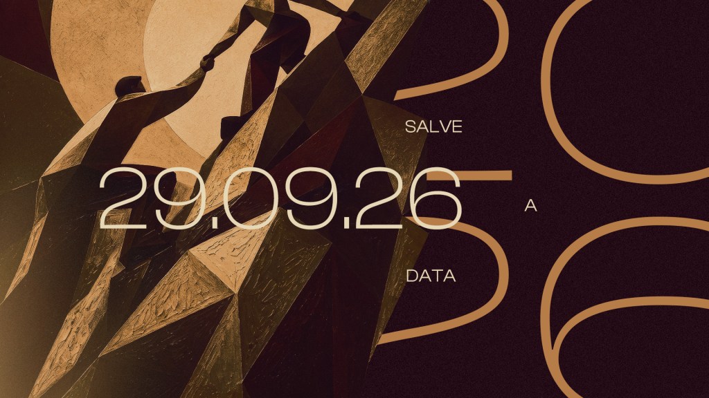
Here, the base is a deep wine colour, almost black, that sets the mood for a special night without feeling heavy. Caramel and gold appear as details, and cream brings breathing room to the printed pieces.
For type, widely spaced capitals talk to the ADVB/PR signature. And the 2026, drawn in huge thin lines, became a graphic element that runs across the pieces.
Wine
Caramel
Gold
Cream

Invitations
The invitation is already part of the night.
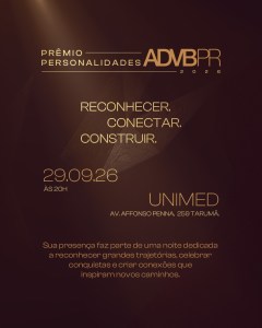
Before any stage, the first contact with the Award is the invitation. So it had to anticipate the experience.
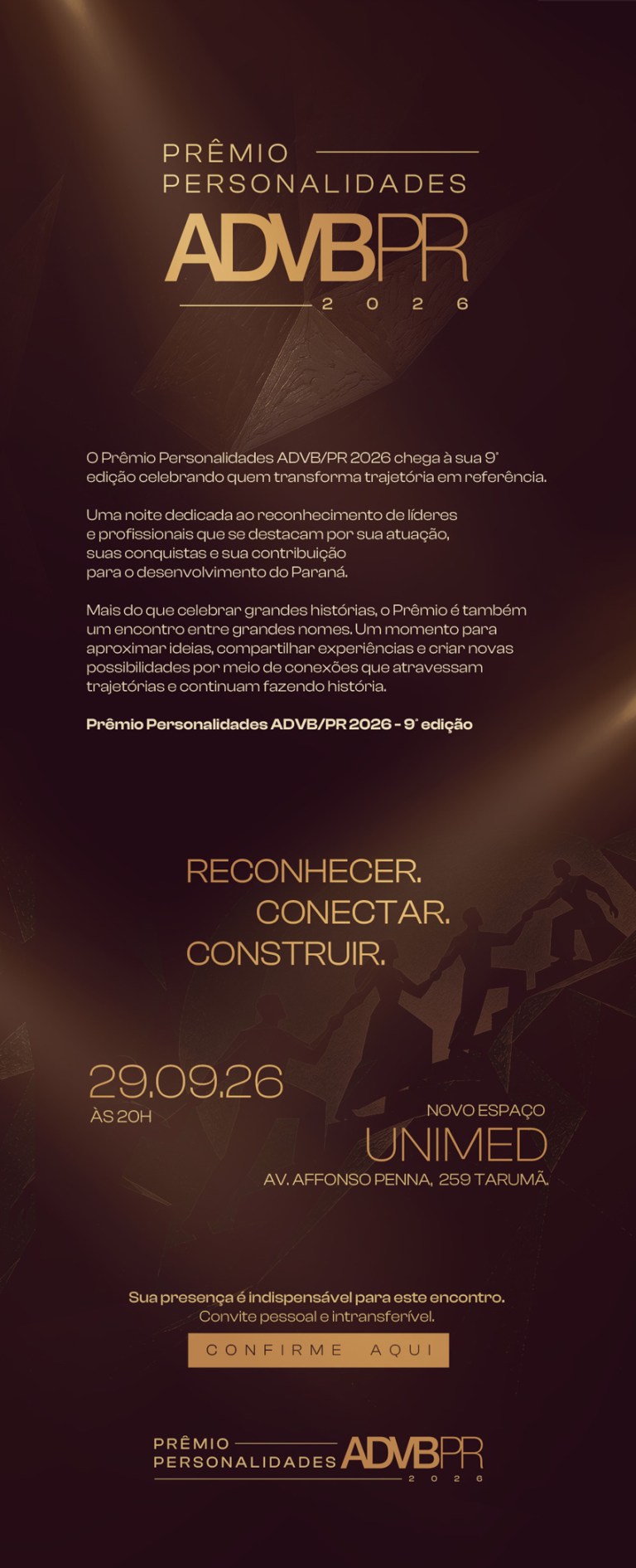
In print, the caramel envelope and cream card bring the illustration with a tactile presence. In the email and WhatsApp versions, the same language adapts to the screen, with the date, venue and the three verbs always in sight.
However people receive it, the feeling is the same: being invited to something special.

Digital invitations
At the event
The concept in motion.
This is where the concept meets the people. The reel shows a little of the night’s atmosphere and the people who give the Award its meaning.
In the end, the identity had one job: to make room for people to be the centre of the night.
Prêmio Personalidades ADVB/PR 2026
Recognise and connect to build the future.
If your event needs an identity that welcomes people before the night even begins, let’s talk.
Project credits:
Concept & Art Direction: Maichel Bueno
Copywriting: Igor Pagliuso
Account Management: Rayra Karollain
Creative Direction: Ricardo Mercer
Agency: CandyShop