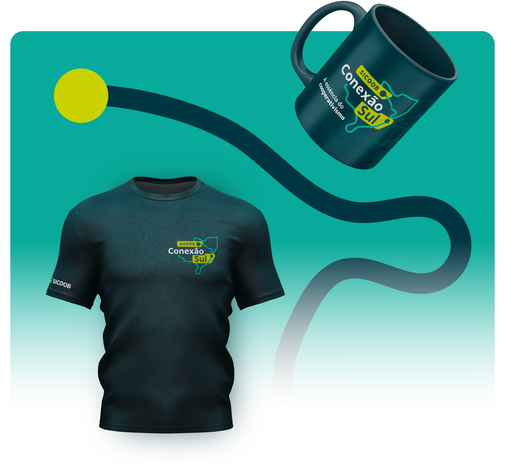
Visual identity for the Sicoob Sul Event
Every event wants connection, but turning that word into an image is the real challenge. For Sicoob Sul’s year-end event, we were invited to create the visual identity, uniting the two southern states under a single concept, aligned with the brand’s modern and tech-driven essence.
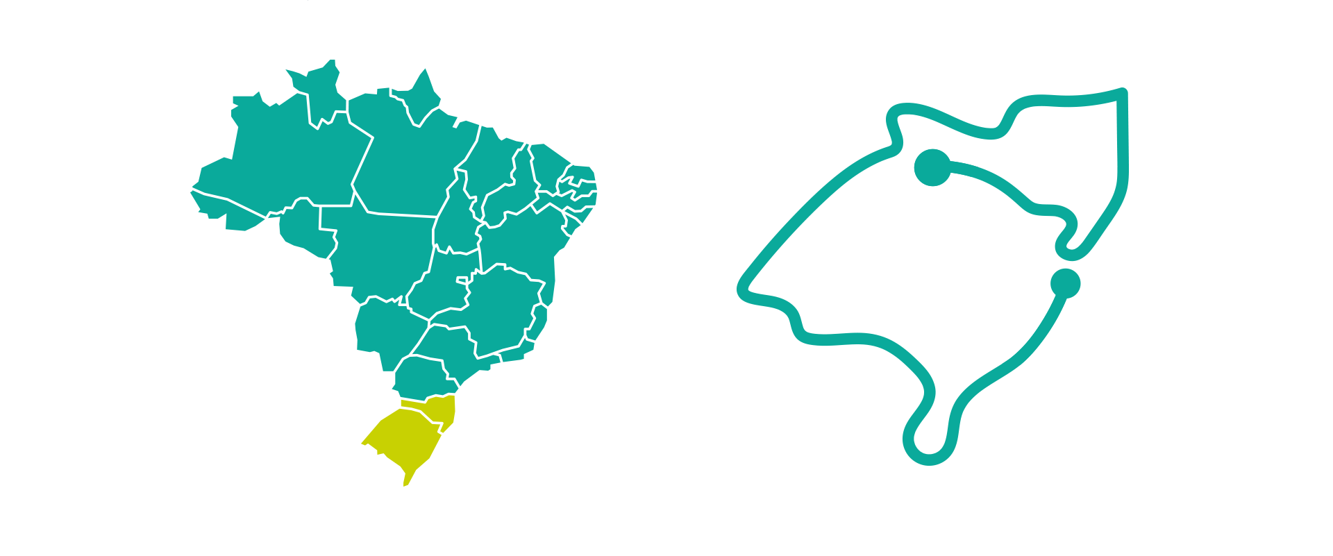
The logo features a graphic shaped like the maps of Santa Catarina and Rio Grande do Sul, linked by a line with two dots, symbolizing the connection between the states and the event’s theme, simple and effective.
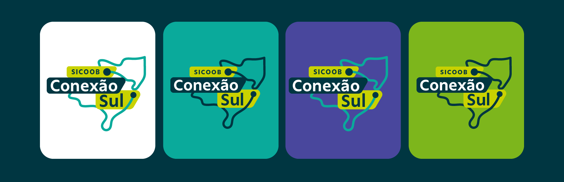
The colors were designed to be fluid and adaptable to any background, ensuring legibility while staying true to the original concept.


Backgrounds come to life with outlined graphics of landmarks from the two states, creating a rich and immersive visual identity.
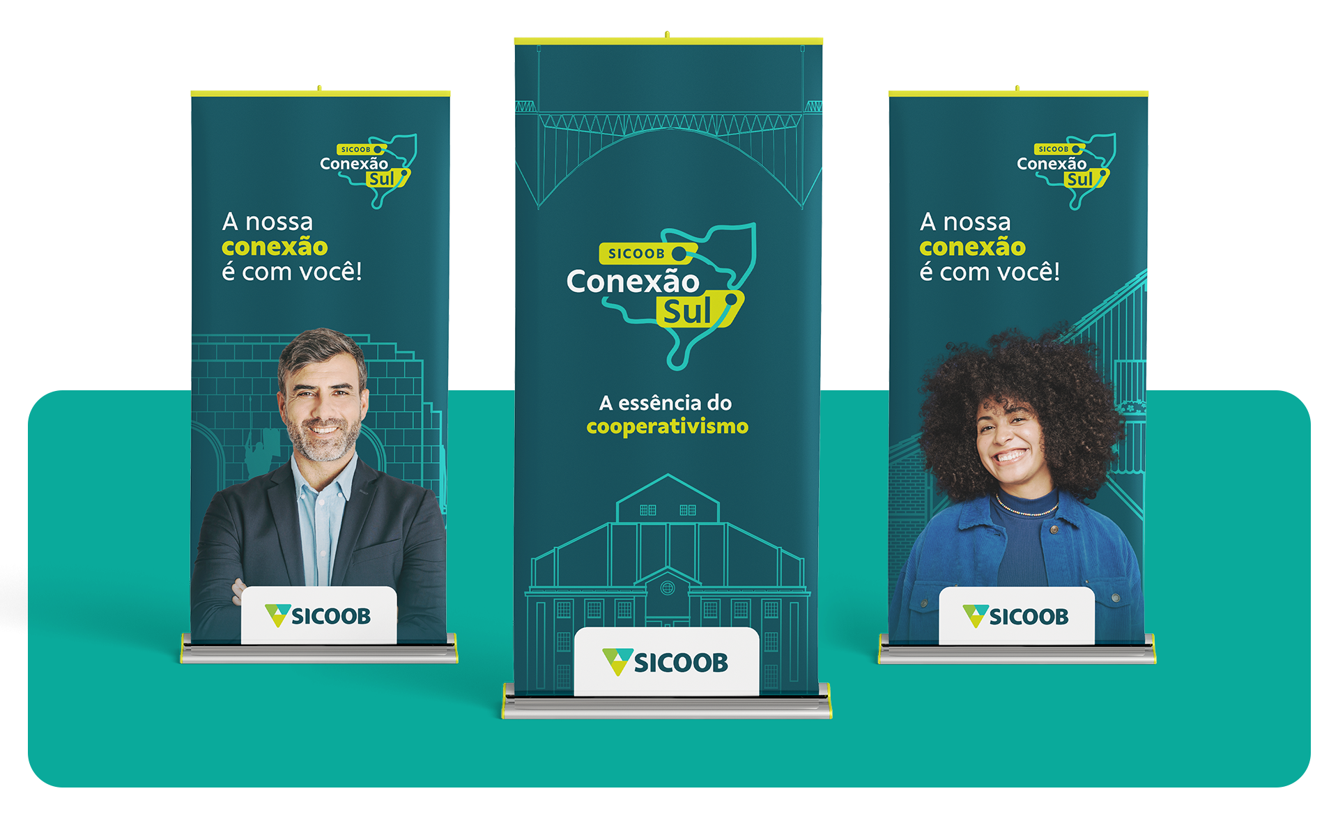
We also selected and personalized brand icons that connect to the theme, helping create more dynamic and engaging materials while reinforcing the event’s identity.